Post 1: Where to Begin
I was going to start the series talking about inspiration versus distraction. Procrastination and how to avoid it. That sort of thing. Instead, I thought I should focus on how to begin. I get a lot of questions from people telling me they’ve started writing a book (fantastic! First hurdle accomplished—you started!), but they really don’t feel like they know what they are doing and they don’t even know what kind of font to use of how to format the manuscript. It’s this last bit that I’ve noticed creeping in again and again.
We get hung up on the details. “I can’t write book! I don’t even know what font to use.” Never mind that it’s your subconscious telling you “Damn, this book-writing thing is going to take a looooooooong time. Maybe I should find some reason not to do it.” Getting hung up on the details is easy to do.
Writing a novel takes time. And it’s not easy. If it was, then all the thousands (or maybe millions) of people who always say “Oh, I’ve got a terrific idea for a book,” would actually write it. But they don’t. Having an idea is pretty easy for some people. Typing for several hours a day for weeks and weeks? Not so easy. Even typing for a half hour a day every day in a year isn’t easy. You can type a book either way, but few people will ever do it.
For the time being in this series, I’m going to assume you have inspiration. You have ideas. You’ve already decided you want to write a book (or better yet, several books). But you are confused about how, or what comes next.
So let’s dispel some myths and get down to actual things you can do. First off, there are great books about how to format manuscripts. But every single one of them will tell you to do it differently. So how does that help? If you know you plan to submit your book to agents, and eventually to big publishers, it’s probably best to follow their rules. Start with buying Chuck Sambuchino’s book Formatting & Submitting Your Manuscript. Actual samples, and he explains what most agents and publishers will be looking for. Even still, once you find an agent, they might tell you to change things. Once you find a publisher, they’ll tell you to change things. Are you getting the idea how mostly unimportant formatting is until the book is about to go into production?
But that’s all if you want to go the old traditional route. The bulk of my advice in this column will be geared toward those looking to self-publish or “indie publish”. If you are confused about the difference, my definitions are simple: self publishers are authors that write a book, slap a cover on it, and release it as an e-book, probably just through Amazon. If they get out a print edition, chances are good it’s through Createspace, and it lists Createspace as the publisher. An indie-published book can still be from a single author, but they took the time to form their own publishing imprint, they paid for proper editing and have a professional looking cover and flawless formatting. In other words, a typical self-published book might look just like what it is. An indie book will be indistinguishable from a book published by a Traditional publisher in New York—unless you know what to look for.
So if you plan to put the book out yourself, here’s a helpful thing to know: you’ll need to format the novel at least four different ways when you are done. That’s right. Four. One for Kindle, one for Nook, one for Smashwords (which will spit the book out in an additional 8 or 9 ways), and one for print. You might even need an additional way for Kobo now. Not sure yet. So what to do? Where to start?
Ask a dozen self-published or indie-published authors and you might get that many answers. (Noticing a trend when it comes to formatting yet?) My preference is for the Kindle format. Keep it simple. In my opinion, the Kindle format is pretty simple, and I make more money off Amazon than I do from Nook or print or anything else, so for me, I want that format to go live first. Makes sense to write the book in that format.
But make no mistake: you can write the manuscript in any format and just get it ready for Kindle (and all the other delivery styles) later on. But for me, I try to keep the book in the right format as I go. Saves me a step later on. Here’s what I do.
1: Use Microsoft Word. The rest of this info is geared toward its use. If you want to use something else, you can, but Word is the standard.
2: Use the default page margins.
3. Familiarize yourself with the Show/Hide Formatting button, and learn what the formatting symbols look like. There are really only a few you’ll need to use, but you should know what the others look like for when you encounter them.
- You’ll get a black dot for each time you hit the spacebar.
- If you hit Ctrl and Shift and keep them depressed, while you hit the spacebar, you’ll get a non-breaking space, which looks like a little raised circle (like the symbol for degrees in temperature).
- There’s a pilcrow for every time you hit enter—looks like two very tall, skinny capital letters T, joined at the top and with a big black ball lobbed onto the left side.
- If you hit Shift while you hit enter, you get a Soft Return. Looks like a little black hooked arrow pointing left.
- Finally, the tab key will give you a straight arrow pointing right. There are more, but these are the main ones with which you’ll need to deal.
4. Now that you know what a Tab looks like in the formatting view of Word? Don’t use it. Ever. When you want to indent a paragraph at the start, you go to Format Paragraph (different ways to get there depending on which version of Word you are using) and under Special, select First Line and a measurement of .3 inch. Ignore what you’ve heard about needing a full half inch indent on paragraphs. That was for print books—not e-books. If you’ve seen any e-books with a half inch indent, you’ll know how ludicrous it looks. For the first paragraph of a chapter (or of a new scene in a chapter where you have a break just before it) don’t indent the paragraph. You can, and I’ve seen it, and it looks fine, but you can not indent the first paragraph too. It looks fine, professional, and it’s one less step. Plus it visually sets that section aside for readers and subtly indicates to them: “Hey! New section here.” The nice thing about the setting is Word remembers it and applies it to every new paragraph for you, so you don’t have to set the first line indent all the time. Only on new chapters or new scenes within a chapter.
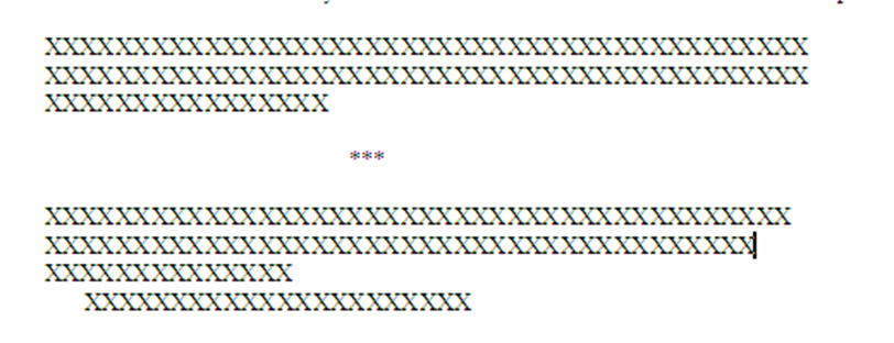
5. Speaking of new scenes within a chapter…how about those? I leave two pilcrows, each with a non-breaking space, between sections within a chapter. If you don’t include the non-breaking spaces, you can’t guarantee what Kindle will do with it. If you include the nonbreaking spaces, you’ll get the spacing you want. If you don’t know what I’m talking about here? I mean sections you’ve seen like this in books in the middle of a chapter:
Traditionally, publishers left a little break like that with some kind of symbols like the asterisks above, to indicate to the reader that the chapter is starting a new scene. Why would you do this? Mostly to introduce a new POV from a different character, or to show the passage of time. Why not use the asterisks or some other symbol? Not needed. What you see up there is three lines: two blank and one with the asterisks. Instead, just go with two lines (so hit enter for each) and put a non-breaking space on each (Ctrl and Shift while hitting spacebar). Another example in the next point.
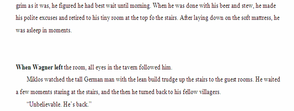
5: For new scenes after the break? Bold the first few words of the new scene. You can, so why not? Looks nice:
You can be anal about it and make it always three words (which I do), but sometimes it’ll look nicer to bold more words than just the first three. Up to you how you do it, but be consistent throughout the whole book.
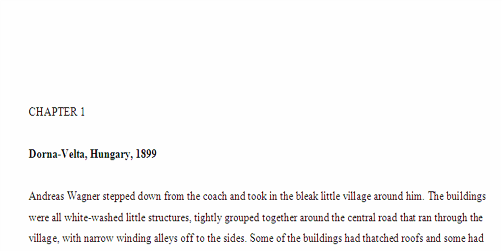
6: What about chapter heads? Be consistent and simple for the Kindle. Here’s an example of one of mine:
What is that actually? Two lines with a non-breaking space each, followed by the line with CHAPTER 1. Note that I made those letters caps the old fashioned way: by holding the shift key. For one thing, I disabled the bastard Caps Lock button on my keyboard (Google it). I now never accidentally hit it, which is nice. But the important thing to note is that if you use Word’s fancy Format Font technique to make the letters capitals, it will play hell with Kindle’s formatting engine. Don’t do it. Just learn to use the shift key.
Next, you’ll note another blank line. That’s again a non-breaking space and an Enter. Then the location line, because it’s a thriller and I use a lot of locations, so I throw in a location line. I make these bold. Again, not with the Format Font technique, but by using the keyboard command for it: select the line by clicking in the left margin next to the word Dorna, and hit Ctrl and the B key. Boom. Done. Then another non-breaking space on the next line, then I start the chapter.
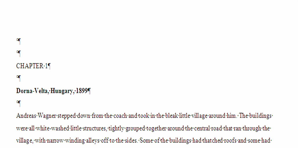
Here’s what the same thing looks like with formatting marks:
See the pretty format marks? Learn to love them, and keep them visible as you type. Helps to prevent making mistakes that you’ll just have to correct later.
7: Then how do you end a chapter? Two ways. Either add a set number of lines with non-breaking spaces (like four) and then start the next chapter, or do like I do. Insert a page break at the end of the chapter. That way the next one starts at the top of the following page. Two schools of thought on which is better, but I like the breaks because I’m going to be using breaks in formatting the print edition anyway, and I can use a search and replace function to change all the Page Breaks into Next Section breaks for the print edition. Plus I like the look of the blank space you’ll get at the end of the section, and that the new chapter always starts at the top of a page. In Word, you select Insert > Break > Page Break.
8: Keep all your chapters in one Word file. Don’t mess around with a different file for each chapter. It’s a pain to slap it all together at the end, and invariably you’ll have different formatting at the end. One file, but make sure to back it up in a few places. I keep my files on my hard drive, on Dropbox, and on an external hard drive. I only ever work on the one on my computer, and then over-write the versions on Dropbox and the external. Come up with a system you like but back up to at least 3 places—and one of them should be remote. If my house ever catches on fire, my files are offsite on Dropbox at least.
9: Use Times New Roman 12. You can use other things, but older Kindles only handle a few fonts, so don’t get wacky. You’ll want single line spacing for your finished Kindle file, but while you are writing, you’ll find that a 1.5 line spacing will be more comfortable to read through. You’ll change the line spacing back to single when you format for release. Also, if you can afford one, a mouse with a fast scroll wheel, is really useful when working on long documents like a novel.
And that’s it for basic formatting. We’ll revisit formatting later in the series, when we talk about actually doing it for all the delivery systems, but for now, you have all you need to get started. And that’s the main thing. Get in the chair and bang out the first draft. It all gets easier from there.




Carol "Pixie" Brearley
Kane,
Excellent advice on formatting, much easier to following than trying to wade through the formatting manual on KDP’s website! Thank you so much for taking time to share this with us. 🙂
Pixie
Steve Manke
That was a great post. It also helped me understand one of the touted features in Scrivener. Scrivener’s big claim to fame is the ability to set formatting options at the time of export, or what Scrivener calls “compile.” The idea being that you apply a set of styles to a mobi file and a different set to the epub version. It takes just seconds. From what I’ve read, it works for print as well. I can see why making formatting an after-the-fact process could have a lot of appeal, especially when there’s a need to adjust formatting for so many situations.
That said, I haven’t finished my book yet so I don’t know if I’m saving myself work (as I’ve read in Scrivener reviews) or just creating more later. But it has been nice not worrying about the formatting and just banging away at the story.
I worked for a pre-press company in my prior life. Typesetting and formatting can be a profoundly time consuming. And it’s very easy to make mistakes. Starting with a solid set of rules and is a great idea!
Kane
Steve,
I haven’t really worked with Scrivener, but I’ve heard some good things. I think the trick is to just not worry too much about formatting, since you’ll have to do it so many different ways later on anyway. For me, I like to get one of them out of the way as I go, but it really isn’t as important as people like to think. It gets handled after the fact. The point is to get the writing done and not let little things like “Which font should I use?” act as a deterrent to accomplishing the main goal: finish the book.
Looking forward to reading yours. Get er done. 🙂
-Kane