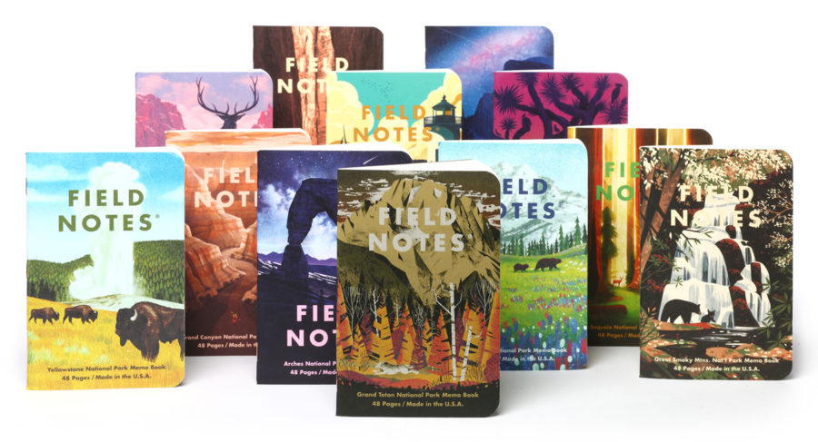
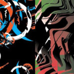
17 National Parks (Arches) Review
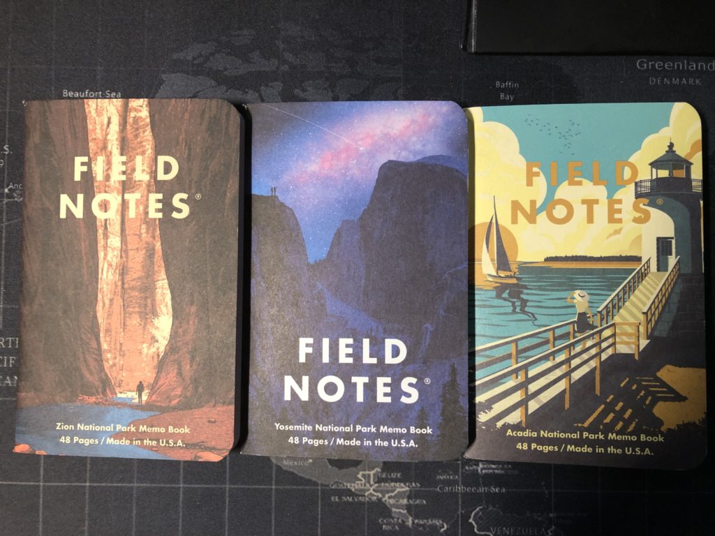
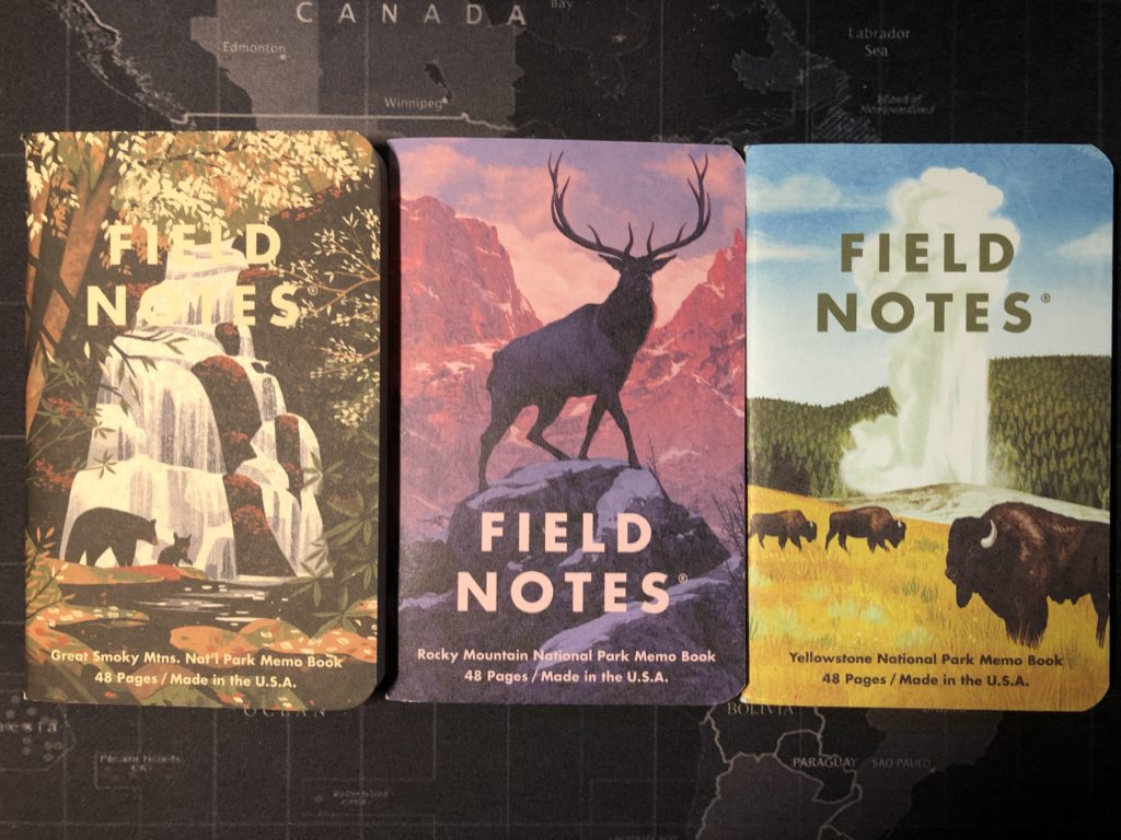
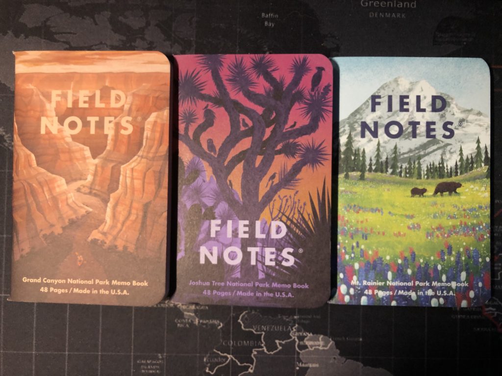
My last pocket notebook was a Sweet Tooth. A little bit of a unique experiment for me, since I don’t like blank pages. My writing is even sloppy on lined/ruled pages. I need a full grid or dot grid to force me into neater handwriting. So, after the sloppy on Sweet Tooth, it was time for me to use a book with a full graph. I finally broke down and used a single from the National Parks limited edition release from Field Notes. National Parks was the release that finally convinced me to drop the money on a Field Notes Quarterly Subscription, and I’ve been a subscriber ever since. So I had received all three of the original sets, as subscribers received one pack each of Set A (which contained singles of Yosemite, Zion, and Acadia), Set B (Grand Canyon, Joshua Tree, and Mount Rainier), and Set C (Rocky Mountain, Great Smoky Mountains, and Yellowstone). Later on, the FN team released a fourth set, Set D (Grand Teton, Arches, and Sequoia). The art on these beauties comes from The Fifty-Nine Parks Print Series, which sells print posters of the designs created by several artists for the fifty-nine National Parks and Monuments in the United States. These are beautiful prints, each available for around 40 bucks. The artists for the FN singles released so far after here:
Yosemite & Zion – Dan McCarthy
Acadia – Telegramme Paper Co.
Grand Canyon – DKNG Studios
Joshua Tree – The Little Friends of Printmaking
Mount Rainier & Sequoia – Glenn Thomas
Rocky Mountain – Rory Kurtz
Great Smoky Mountains – Chris Turnham
Yellowstone – Brave the Woods
Grand Teton – Eric Nyffeler
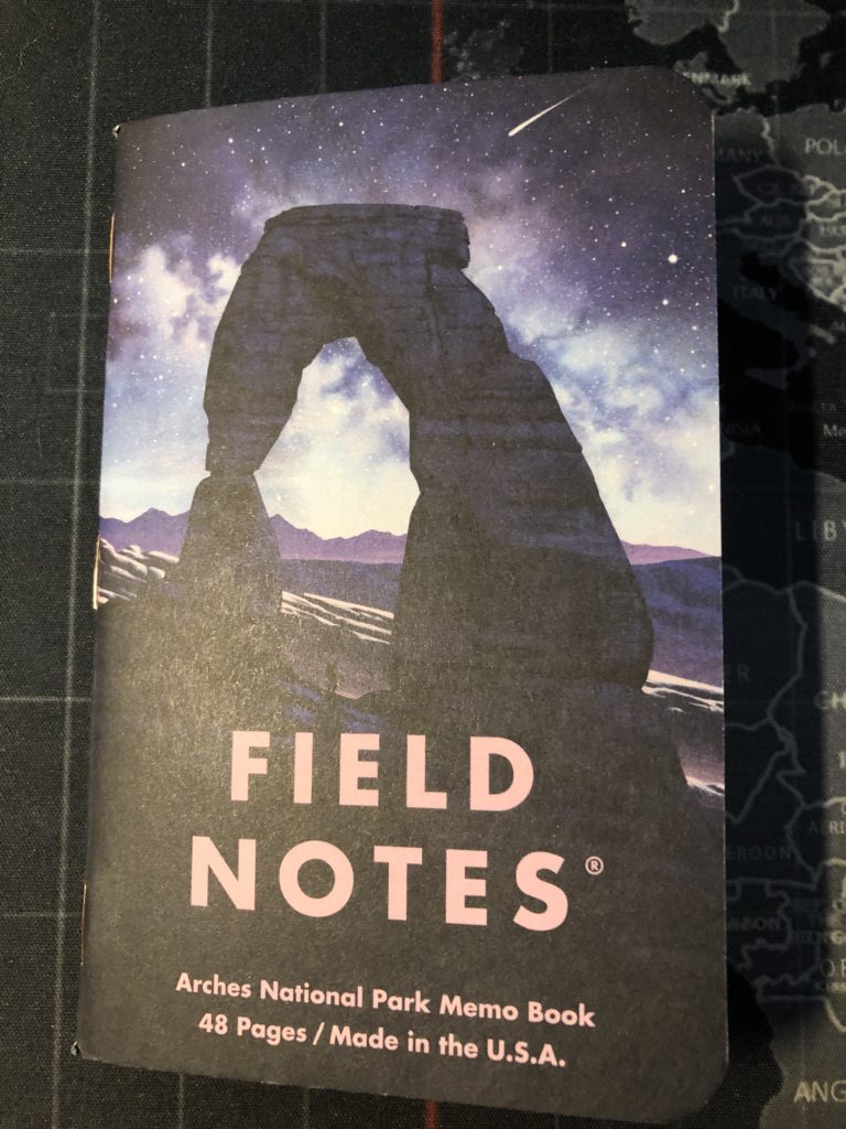
Arches – Nicolas Delort
Sequoia – Glenn Thomas
Head over to 59Parks.net and check out the posters.

Released in the Summer of 2019, National Parks was unusual in that the subscriber bonus was an entire extra pack of Field Notes—Set C. I loved that, and it was the tipping point for me, on taking a subscription. A bandana or a free pencil or whatever is nice, but clearly if people want your pocket notebooks, then an extra pack of them is the best bonus ever!
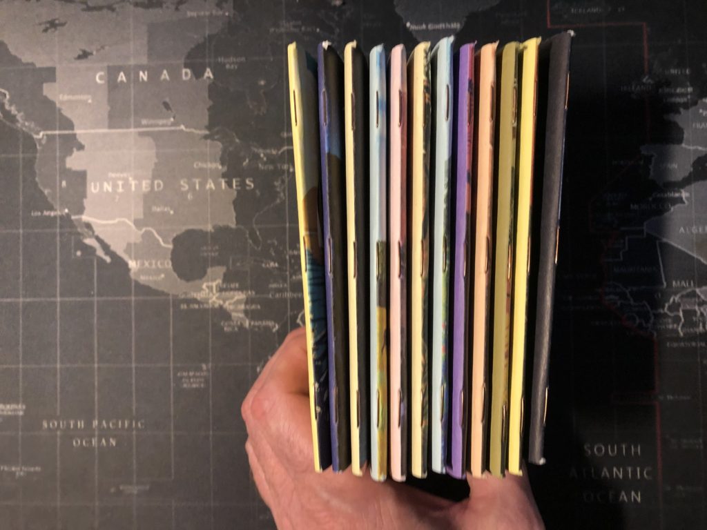
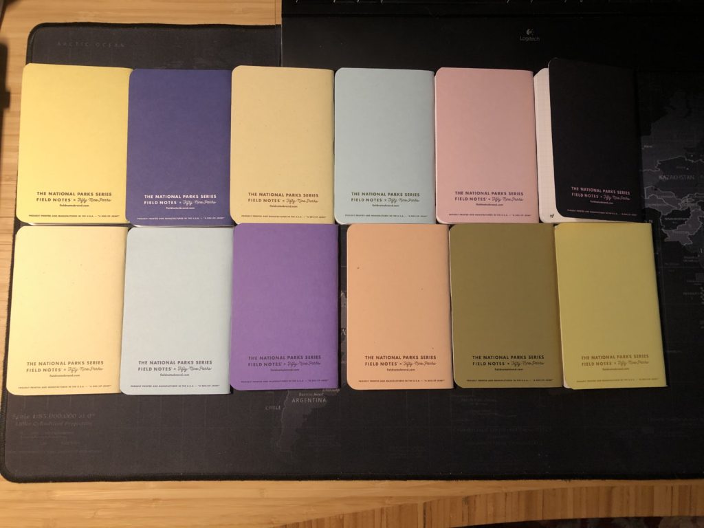
And each book was a different design—and they are all beautiful. I’m pretty sure this was also the first time the logo was displaced to make way for the art, with some books having the FN name at the standard top location on the front cover and some books placing it near the bottom, like on Arches. Also, FN donated 5% of retail and wholesale purchases to the National Parks Service, which is awesome.
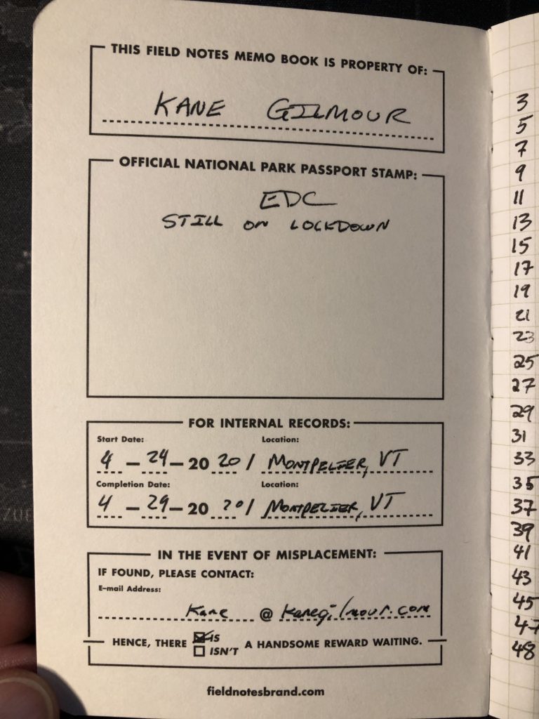
Let’s get to the nitty gritty. These covers were 100# stock from French Paper Company, and they feel thicker than that. Also of note on these books, the covers were not hard folded prior to being attached or something, so the spines tended to look quite thick and rounded, which I personally liked a lot. Maybe that had to do with the cover thickness or the combination of that with the page thickness, but the spines on these looked really rounded. With lovely copper staples, and as the website says, they used a five-color process over a white layer of ink to make the front cover images, so they could incorporate the color of the paper into the image. The inside covers were a different color for each book, and the traditional space on the inside front cover was altered to allow room for an official National Park Passport Stamp, should you visit the park and decide to collect your stamp in the FN single. Nice!
The back covers were a simple flat color from the front cover with the 59 Parks logo and the FN website. The inside back covers varied slightly from the standard by having a field concerning the park in question, in place of the usual Practical Applications section. The Arches single lists the name of the park, the name and URL of the artist, and the name and URL again of The Fifty-Nine Parks Print Series. Then it’s got two paragraphs of information about the park itself.

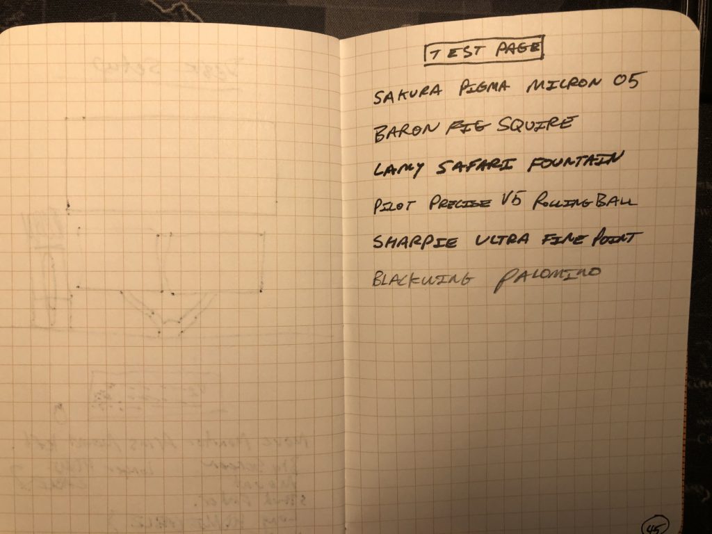
Innards were a lovely Finch opaque smooth 60#T in bright white with a “Green Earth” graph. A little bit of ghosting with rolling ball pens, a LAMY fountain pen, and pigment liners. Only bleedthrough was with a Sharpie Ultra Fine point, which is to be expected of a 60# paper. Still a fine writing experience for most utensils. No idea how this paper would hold up to serious attempts to do watercolors or whatever on it, but for writing? This paper is just fine.

Overall, how great was this edition? It’s funny. I’ve heard mixed reactions from people on this one, but I loved it and still do. I love it so much in fact, that if I were to try to hook a newbie on FNs, I’d introduce them to the memo books by using this very edition. It’s still widely available. It’s also listed as a “First Printing” on the inside back cover of mine, with no mention of edition size—either on the books or on the website. They released that fourth set after three months, and at that time Field Notes Brand said were into a second printing of the first three sets. Also, I have it on pretty good authority that there will be a fifth set as well. Hopefully these books will become a permanent addition to the lineup. I feel they are that good. One final oddity of note: these books did not come with belly bands, as most FNs do, but rather they came with a single card in each set describing the contents of the set and labeling it as either Set A, B, C or D.
Already have a set? Go buy some more. You’ll regret it when these are gone.
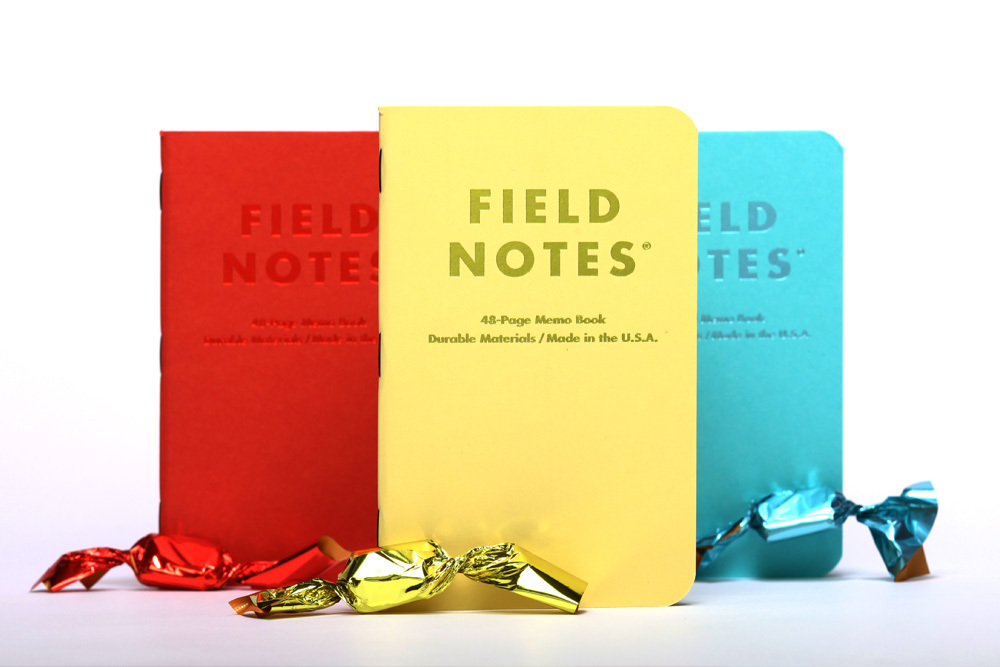
16 Sweet Tooth (Blu Raspberry) Review
After using the Commemorative Reprint and spending a few days in a thin 50#T paper, with bleedthrough and tons of ghosting, I decided it was time to try something…a little thicker. I had loved that 70# paper in the Workshop Companion and the recent Group Eleven, so I decided to go back to it, but I also wanted to try something different and wacky. For this lover of grid and graph papers, that was going completely with any markings at all. The blank page is mostly not this writer’s friend. My writing tends to slant pretty badly without guidance, and it gets sloppier as I go. BUT, I dove into a Sweet Tooth single anyway. How could I not at least try it? The colors are soooo inviting. And I was shocked to discover…that I had a great old time.
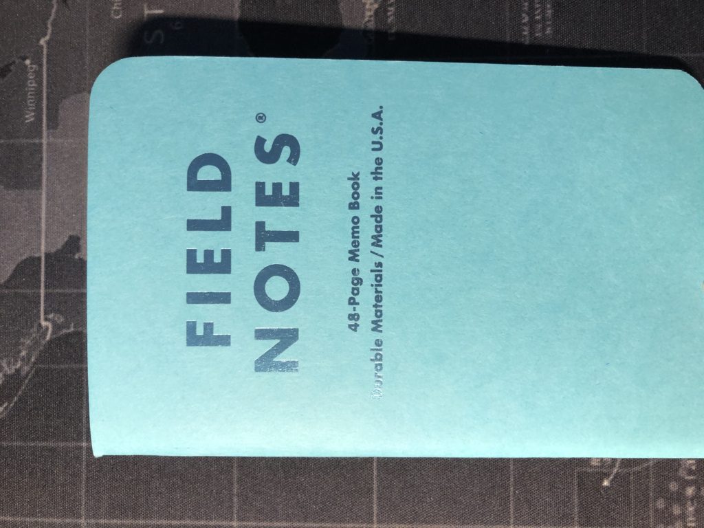
Released in the Spring of 2016, Sweet Tooth was an odd one. A field Notes first with perforated pages. And each book was a different colored cover—and the pages were the same color. Pretty sure that was also a first for FN. Those colors were fabulous. “Blu Raspberry” was what I used. The others were called “Banana Split” (the yellow) and “Tangy Orange” (which to my eyes look very red rather than orange.) French Pop-Tone 100# covers with matching colored foils. These covers were great. The color really pops, the foil lettering adds some elegance, and the thickness of the covers felt even slightly thicker than some other 100# covers from FN. Really nice.

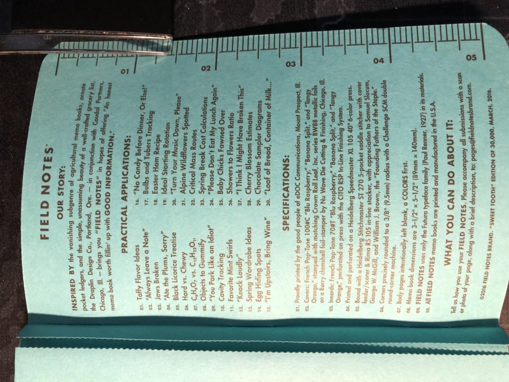
The inside covers were easy to write on, and the back inside cover features the standard FN sections, with a Sweet Tooth-themed Practical Applications section including beauties like “Jaws Broken”, “Egg Hiding Spots”, and “Baby Chicks Fawned Over.” But, cleverly, the Practical Applications also includes a list of notes one might write on these perforated pages, and tear out, then leave for someone else, such as “You Park Like An Idiot” and “Please Don’t Eat My Lunch Again.”
Then there’s the paper. I’ve seen a lot of artistically inclined users prefer Sweet Tooth for their ability to draw and even paint in them, and then detach the sheets. But this user was just going to rely on writing, so that’s all I can review the paper on. However, for this one, I specifically bought a fountain pen to test it out on the paper (and I’ve mentioned that LAMY pen in a few previous reviews, but I only used the pen on those books while reviewing them, several weeks after the fact of using them. For this one, I used it from the start.) So how does it hold up for ghosting and bleed? Let’s put it this way: A Sharpie Ultra Fine point had a bit of ghosting but no real bleedthrough. The rest of the pens I tried (Pilot Precise V5, Baronfig Squire, Staedtler Pigment Liner 0.3, and even the fountain pen)…no ghosting at all. The pages are thick, and the color helps to disguise any writing on the opposite side. Also, for you pencil folks? Blackwing and Sweet Tooth make sweet love to each other. So, if you really hate seeing even a hint of the writing on the other side of the paper? This is a great edition.
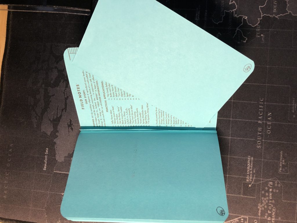
Finally, how awesome is the perforation? It’s gonna depend on your need to tear out pages. I never do that to an FN notebook or an A5 hardcover notebook. I’m astonished that some people feel the need to do so. If I need to give someone a piece of scrap per? I’ll find some scrap paper. I would never ruin my notebook for that. BUT, I tested a page’s perforation for this review. I mean if you’re going to have perforation, it had better tear perfectly along those dots and leave no ragged edges or tear the page at all. My test results. FN gets a 100%. At the end of using the book for six days, I have to say I really liked it. Only thing that could improve it in my mind and for my purposes would have been to slap some dot grid on it. As someone who doesn’t tear out pages, I could take or leave the perforation. But the covers and paper were gorgeous.
15 Commemorative Reprint (Butcher Orange) Review
AKA: As close as most of us will ever get to using an original Field Notes Butcher Orange single.
Way back in the halcyon days of the winter of 2008, Field Notes released their very first limited edition (which was originally called “colors”). The edition, which had just 500 packs printed, was called Butcher Orange. It sold out in pre-order. (Although I am reliably informed that six months later, FN released a retail edition of an addition 1000 packs, which explains why the original Orange shows up more frequently than the Butcher Blue).
Eight years later, in the spring of 2016, Field Notes surprised their subscribers with a bonus shipment that contained two-packs of Butcher Orange and Butcher Blue (the second limited edition). But they went one step further and had the title on the belly band be the name of their subscriber. Wow! Fantastic idea, and probably a logistical nightmare. I’ve also seen some editions where the belly band has the address of Filed Notes HQ in Chicago, and some that just say “Commemorative Reprint” on the band.
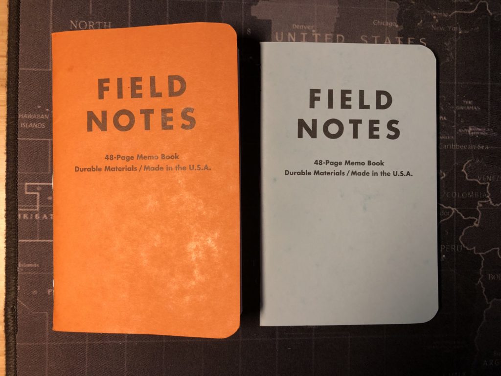
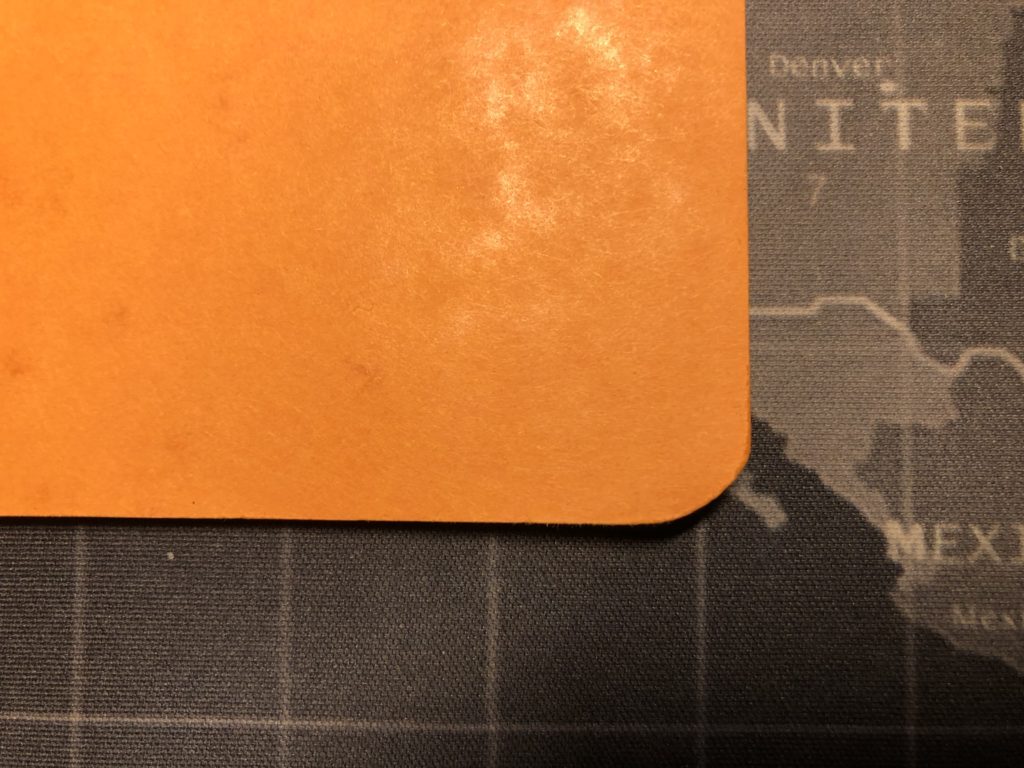
While ostensibly these reprints were exactly the same as the originals, in fact there were several differences. On the orange single, the details inside the cover reveal that the reprint’s cover is identical to that of the original: French Paper’s Dur-O-Tone 80#C “Butcher Orange”. However, the innards are listed as Finch Paper’s Opaque Smooth 50#T in a ‘Bright White’. The website for the original Butcher Orange pack lists “Boise Offset Smooth 50#T white”. We can assume these papers were very similar, but there is a slight difference. The cover of the Reprint and the original were both printed on a Mitsubishi Diamond Series 6-color printing press. However, the innards of the Original Butcher were printed on a Didde 5-color printing press, while the reprint was printed on a Miller 2-color press. Again, probably not much discernible difference to the end user, but worth noting. The original was bound on a McCain 8-pocket saddle-stitcher. The reprint was bound on a Heidleberg. Perhaps the one area where they could have, and should have, used an updated piece of machinery was the corner rounder. But both editions were rounded on a CRC, and as we’ll see below, poorly.
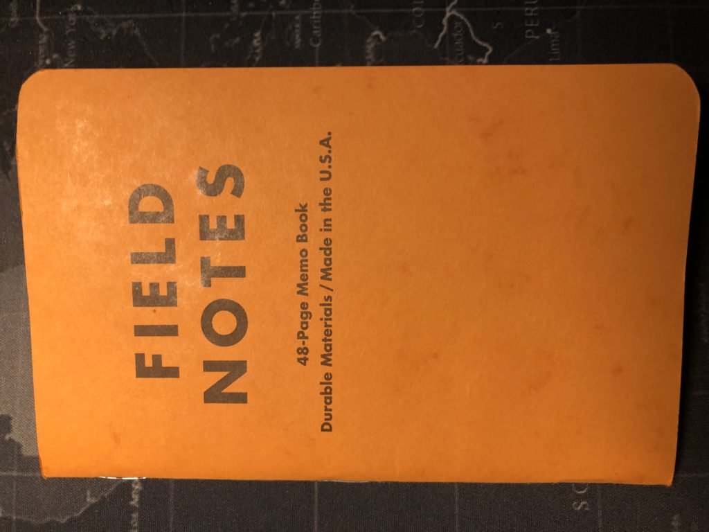
I wasn’t aware of Field Notes when they first offered the Butcher Orange in 2008, but had I been, I can say I probably would not have been impressed with that edition. For those who have not seen one up close, it’s called Butcher, because the paper has what appear to be grease spots all over—like butcher paper—the kind originally sold to butchers with which to wrap meat. It’s a cheap but sturdy paper. While the orange color itself is nice, the greasy spots are less so.
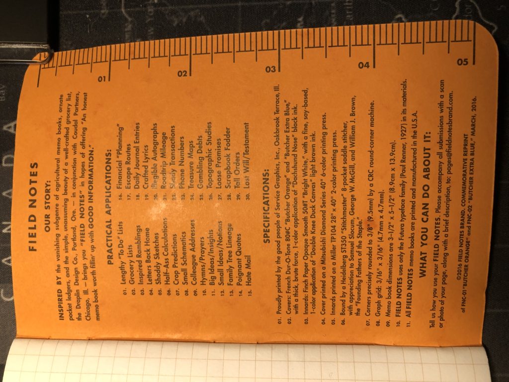
The inside back cover is the standard list of Practical Applications—we can assume because the original Butcher Orange had the same list as found in the standard Kraft brown set. Presumably the only difference in the Commemorative Reprint version is the edition notes at the bottom.
So yeah. After using the book for just two days, I was ready to look at a different cover.
But really, the innards are where the rubber meets the road on these little books, and 50#T just doesn’t really cut it for most purposes. Ghosting with any implement short of a pencil—and even a Blackwing Palomino shows through slightly. Rolling ball? Not so good. Sharpie? Forget about it. Complete bleedthrough. Lamy Safari fountain pen? Bleedthrough and feathering. I ended up needing to use a Sakura Pigma Micron for much of this book. The pages even felt thin to the fingers. But my biggest aesthetic gripe was a not-well-rounded upper right corner—a problem I’d seen on my County Fair set as well. Seems the old CRC corner rounder that FN had, was…not very good. We see much better corners on most editions after they started using a Southworth corner machine.
In closing, was there anything good to say about using the Commemorative Reprint Orange? Yes. It made me realize I had no desire to hunt down and actually use an original Butcher Orange or Butcher Blue. It was a unique experience. I wanted to like the book for what it was, but ultimately, I’d already been exposed to the company’s better, higher quality products from latter years, so experiencing what it used to be like was less of a thrill. I decided I did want to hunt down and use and review all of the limited editions, and I think for me, Commemorative Reprint versions of Orange and Blue will suffice just fine.
14 Field Notes Workshop Companion (Gardening) Review
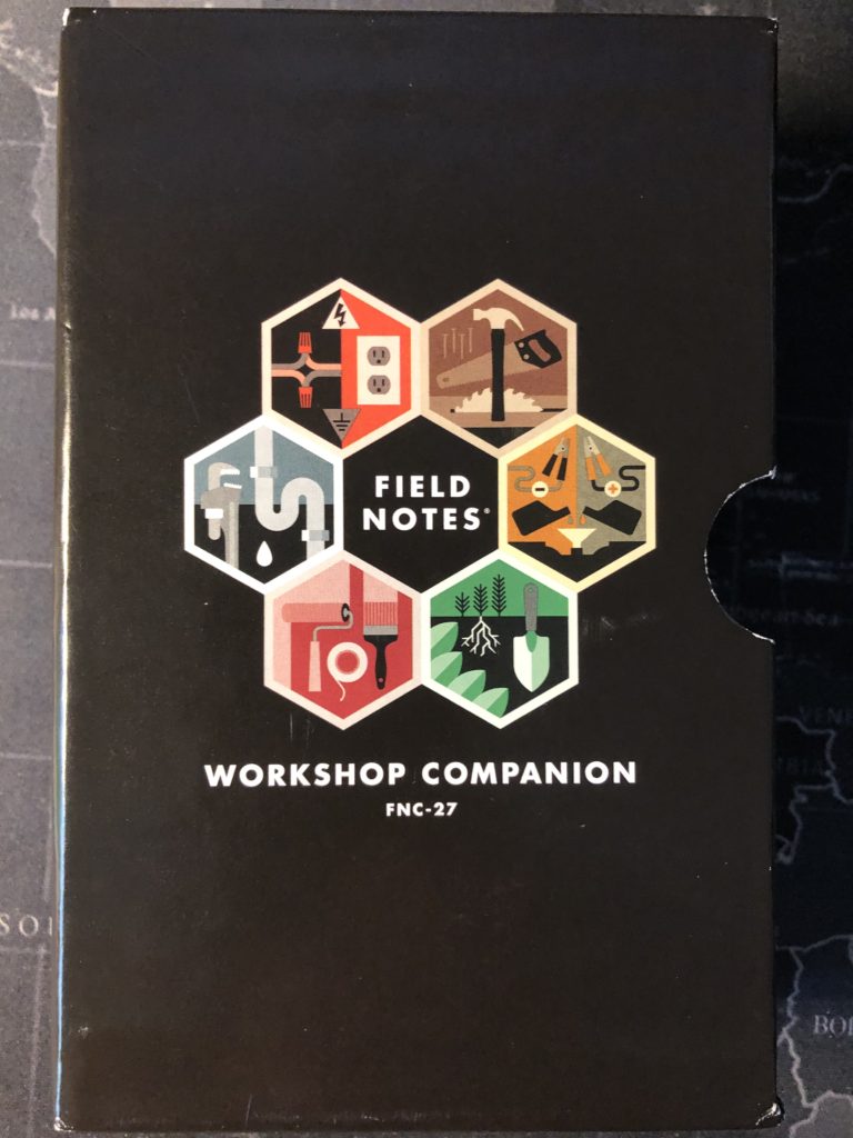
It’s the return of Your Mileage May Vary—my reviews of pocket notebooks that I use, and more specifically, of Field Notes brand notebooks. This time: the mighty “Workshop Companion.” WC was released as a Field Notes limited edition set in the summer of 2015. A set of six different books, they came sealed in a custom-made slipcase, and the set included a sheet of six stickers. Subscribers also got a “Measure Twice, Cut Once” magnet.
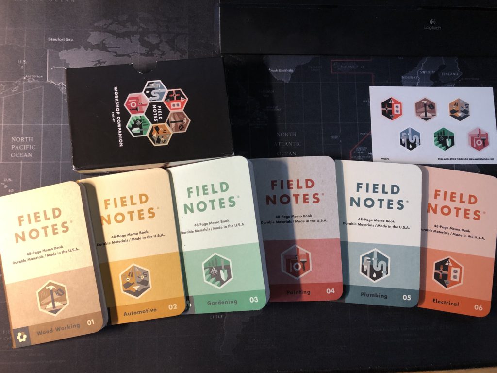
I am not a handyman. Not really. I mean, I can fix the odd thing around the house, but I’m mostly the tech support guy. Wiring and computers, I can do. So, the fact that this set appealed to me so much, when I first saw it, is strange. I worked hard to get my hands on my first set—and since I only started collecting Field Notes in 2019, that was not easy task. But before I knew it, I had seven sets of these around the office. The set features a hexagonal design theme that is repeated in multiple places, from the cover of the slipcase (and even the insides of the slipcase!) to the stickers, to the covers of the actual books.

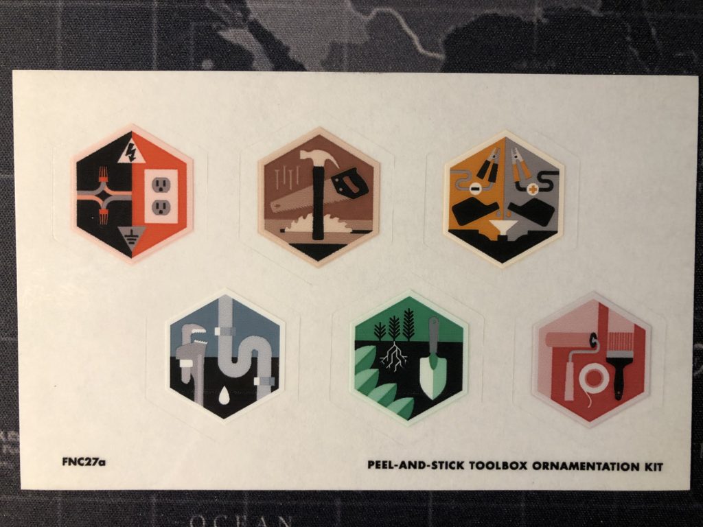

Each set contains a brown “Wood Working”, a yellow “Automotive”, the green “Gardening” book I chose to use, a red “Painting” book, a blue “Plumbing” book, and an orange “Electrical” book. This was (as far as I know) the first time FN decided to print the labels of what the books were on the spines. Now, considering this is just a 48 page ‘saddle’ type book with staples on the spine, I don’t think that was a wise decision, but I’m sure someone thought: “But in the slipcase you won’t know which book is which without labels”. In any case, that’s a minor gripe. The set’s themed look, colors, logos, numbers, labels, and details are all wonderful.

First thing you notice about the single book is the way the logo pops at the top against a lighter colored background on each of the books. Each book has a corresponding symbol—so Gardening’s was a few plants, and a gardening trowel. The bottom of the front cover shows the Gardening title, and the book’s number in the set—03. The lower left corner even shows the book’s position in the interlocking hexagonal symbol loop on the slipcase. Another clever design element. Each book has a color-coded stripe up the spine—which I feel would have been fine for identification purposes without the text. If Field Notes were ever going to make this set a part of their regular line, which I feel they should do, they could just leave that spine text out next time.

The back covers are packed with details. A quote, Great Moments in Gardening, Tradesmen of Note, Pro Tips, a list of Tools of the Trade, Gardening Jargon, and on the Gardening book—a section on Annual Average Low Temperatures in the continental US. That section is replaced in the other books in the set by the following sections: “Nail Varieties” (Wood Working), “Spark Plus Diagnosis” (Automotive), diagram for “Painting a Room” (Painting), “Pipe Sizes” chart (Plumbing), and “Wire Gauge” chart (Electrical).

The covers themselves are a super-thick Kraft-tone 100#C but they feel thicker than the typical 100# covers for some reason. Also, like the interior pages, the cover stock has visible fibers in it, which adds to the overall aesthetic of the set.
The inside back cover includes workshop-related Practical Applications like “Pegboard Layouts”, “Duct Tape Repairs”, and “Honest Contractors”. The list is the same throughout the WC set.

The innards in this set are a dreamy 70#T white with a dot grid in “Maple Lacquer” brown. And, as mentioned, the pages have visible bits of fiber in them. But not so much as to be distracting. I’ve used several of Field Notes’ 70# papers at this point buy this one seems thicker somehow. And issues like ghosting and bleedthrough were negligible. I used a rolling ball pens, a Pigma Micron, a Lamy Safari Fountain pen, a Blackwing pencil, a standard ball point pen, and a Sharpie Ultra Fine point. No bleedthrough—not even with the Sharpie, and the Sharpie was the only writing utensil I tried that had even a hint of Ghosting. Impressive.
Overall, this set is a fantastic, immersive experience. The books hold up well, as you’d expect. The colors are great. The details wonderful. That paper though. So good. Workshop Companion is a harder-to-find set now, but you can probably still lay hands on them for around $30 yanqui dollars. Sooo worth it.
13 Field Notes Drink Local – Ales (IPA) Review
Been a little while since I reviewed a Field Notes. Time for another one. Man, I wanted to get my hands on the Drink Local set. Thought I never would. Then, when FN had their last big sale that involved them throwing in a mystery pack, I lucked out and pulled in an Ales. When originally released back in the Fall of 2013, this set came with two packs of three: an ‘Ales’ set and a ‘Lagers’ set. Subscribers originally received one of each set in a nifty carboard carrying-case that resembled the cardboard cases that actual six packs of beer come in. Clever. For those who are not well versed in their Zymurgy (the study or practice of fermentation and brewing, particularly when it comes to beer), the difference between ales and lagers has to do with the yeast and the temperature at which it ferments.
I’m a huge fan of craft beers, but not so much of the most popular style of the last few years—the India Pale Ale (IPA). I much prefer Stout beer. I was delighted to learn that the ‘Ales’ set of memo pads from Field Notes had a Stout book in ‘dark brown-black’, an Amber Ale book in a ‘warm red’, and an IPA in a ‘rusty orange’ color. This is the IPA you see pictured above. Although I love Stout best, I saved that one for a special day at some point and opted to use the IPA because of the lovely hue of its cover. The ‘Lagers’ set came with Pilsner, Bock, and Pale Lager varieties (gold, brown, and pale yellow respectively), although I didn’t have a set to review.

One other nice feature was that each pack came shrink-wrapped with a 3½”-diameter, 2-color, pub-style coaster tucked into the belly band. Nice! The cardboard carrying case was a subscriber extra, but everybody got coasters.
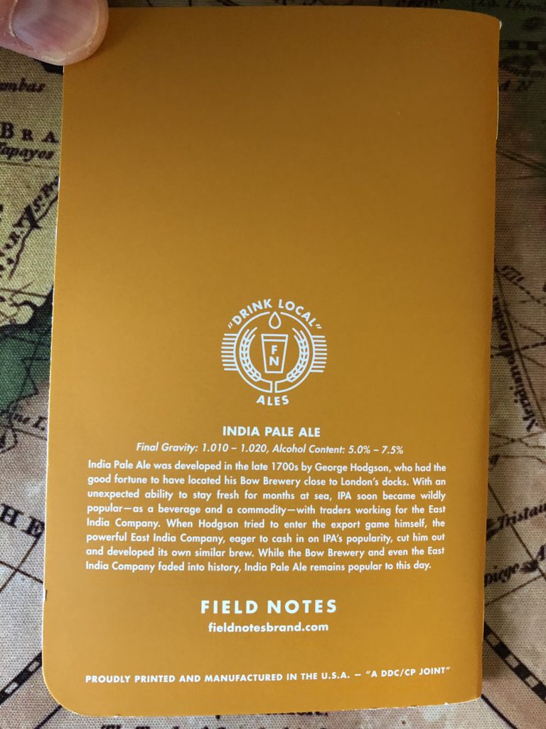
The covers were a thick 120#C with soft touch varnish. Some people love the slick glossy feel to the soft touch covers. Some don’t. I’m one of the latter. It was a sturdy book, but I never loved the feel of it in my hand. Unlike several other cardstock types for covers FN has used—most notably the thick canvas-like covers on the XOXO 2019 that I just finished using. Those things are a joy to hold. Anyway, the covers in ‘Ales’ come with a back cover ‘Drink Local’ logo, followed by a description of the beer variety, including details on its Final Gravity—technical stuff related to the strength of the final fermentation, which is used to calculate the Alcohol Content, a range for which is also provided. Nice details, in other words.

The inside back cover includes beer-related Practical Applications like “Tabs Paid”, “Toasts Toasted”, and “Quarters Sank”. The list is the same throughout the Ales set, and one assumes it’s the same in the Lagers set.
The inside front cover is the standard layout for an FN book, but the Ales books all had a very blackish brown background with white text, meaning you need to bust out those special pens for writing your details. Something like silver or gold Ultra Fine point Sharpie would do the trick. I used my trusty white Sakura Gelly Roll pen.

The innards are 50#T white with a graph grid in “Hefeweizen”, which is listed in the book as a ‘light brown’ (but listed as ‘yellow-orange’ on the website). And the attention to details on this edition extended to the staples, which are a lovely bright gold. Being 50#, the pages do show quite a bit of ghosting, and the occasional points of bleedthrough with a rolling ball pen like the Pilot Precise. I managed to use a Lamy Safari fountain pen with no bleedthrough or feathering, but the Sharpie Ultra Fine point, of course, just soaked right through the thinner paper.
Overall, this was a lovely experience, even though I didn’t love the thinner paper or the slick covers. The book was a vibrant color that made me happy to look at all through the early part of a gloomy Vermont April. They are hard to find now, but I’d say worth the hunt.
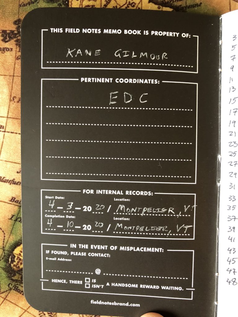
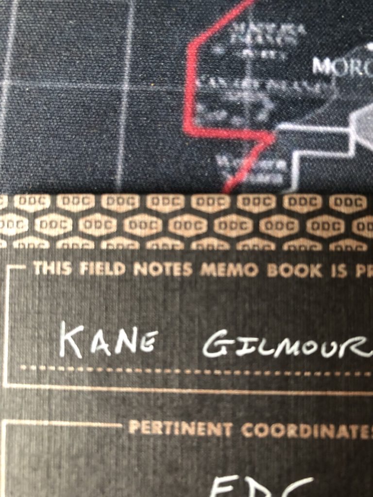
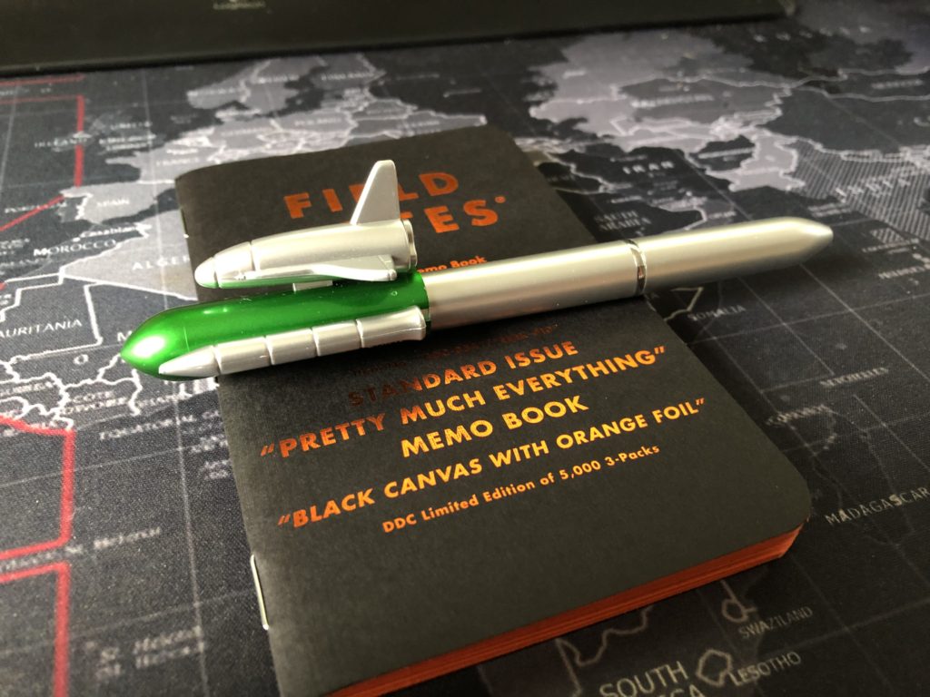
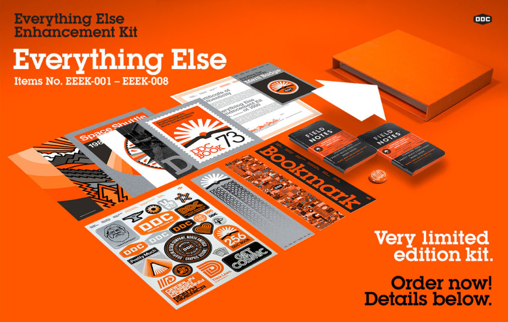
12 Field Notes Standard Issue – “Pretty Much Everything” (aka: ‘EEEK’) Review
I expect for newer users of Field Notes, this one will be of particular interest. Many of you have not seen one of these up close—or you have a sealed pack and you’re not sure whether to open and use it. Or you’re just deciding whether to chase this particular whale. Oh, Ahab, I’m here to tell you, you should get to chasin’. The Standard Issue “Pretty Much Everything” memo book was sold direct from Aaron Draplin’s DDC online store as a part of the “Everything Else Enhancement Kit” to promote the sale of his book. That’s where the more common term of ‘EEEK’ came from. Although the cover states this is DDC-054, which is the number allotted to the regular ‘Dead Prints’, I’m pretty certain this one came out in 2016 with the kit promoting the book.
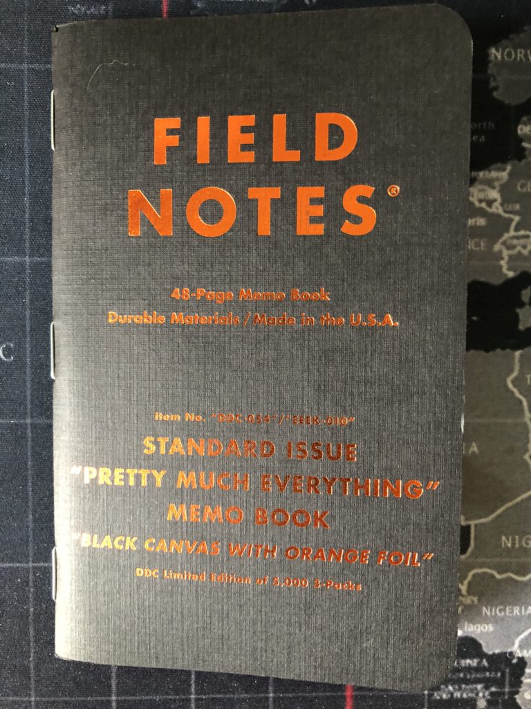
As it says on the cover, it’s a Black Canvas with orange foil, but it’s technically an 80# linen from Neenah, so it feels very similar in texture to a County Fair. The orange foil is actually an “Overload Orange” and the print inside the covers is a “PMS Silver 877” metallic ink with an overprinting of “PMS Orange 021”. The end result to my eye is that the interior print looks closer to Gold than Orange, but the effect is still lovely. The cover is beefy, and the texture is heavenly.
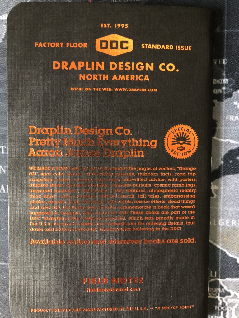
The orange foil really pops—especially on the back cover with all that great text describing Draplin’s book and how this memo book was part of the enhancement kit. Another fantastic element to the design is the repeated DDC logo framing the inside front cover. Also, of course, because the cover is black, that means writing on the inside front of it, you need something special. My white Sakura Gelly Roll did the job nicely.

The back inside cover has the usual Field Notes’ ‘Our Story’, ‘Specifications’ and ‘What You Can Do About It’ sections, along with an EEEK-themed ‘Practical Applications’ section. My favorites are “Typo Crisis Management”, “DDC Merch Deliberations”, and “Shady Transactions”. Interestingly, the copyright info states an edition of 15,000 while the belly bands these come in state only 5000.

Then there are the innards. Orange!!! This was a Neenah Astrobright “Orbit Orange” 60# paper with “a dotted graph grid printed in a fine mist of the most evil ‘Fade to Black’ ink ever to hit orange paper”. And yes, that’s a direct quote from the specifications. In practice, that dotted grid graph looks mostly like a regular graph line to my eye, but if you get up really close, you can see the tiny dots. Of note, since I just bashed the corners on County Fair in my last review, the corners on this edition were perfectly rounded on a Southworth Round Corner machine. Also, the corners at the crease were perfect—no splitting, as seen in so very many editions.
So how was the experience with writing on the orange paper? Wonderful. Every day, writing on this paper felt like something special. Only 60#, but I had no problems with ghosting or bleedthrough—except with a Sharpie I tested for this review. But all the other writing implements I tried out performed perfectly: my trusty Pilot Precise V5 Rolling Ball, a Baron Fig Squire, a Lamy Safari fountain pen, a Blackwing pencil, a Staedtler Pigment Liner, and the bomb-ass space shuttle ball point my daughter got me (seen below). And that Blackwing just slid across the paper like butter.
You can still get your hands on these packs on trade and occasionally for exorbitant prices on eBay. But Draplin’s site is sold out. You can, however, still buy the slipcase from the book that came with the Everything Else Enhancement Kit (for the astronomically high price of 29.99) and the decal sheet (for a much more reasonable five bucks). If you were interested, the original Everything Else Enhancement Kits came with the following:
- EEEK-001 “Decal Sheet”
- EEEK-002 “Merit Badge”
- EEEK-003 “Certificate of Authenticity”
- EEEK-004 “Mini Print Set”
- EEEK-005 “Bookmark Set”
- EEEK-006 “Everything Else Notes”
- EEEK-007 “DDC Pinback”
- EEEK-008 “Troll Excerpt”
- EEEK-009 “PME Slipcase”
- EEEK-010 “Field Notes Three-Packs”
- EEEK-0?? “Mystery Items!”
And here’s a picture of the whole thing.
In closing, if you can get your hands on one of the lovelies, it’s a very worthwhile experience to try one out.
11 Field Notes County Fair (Vermont) Review
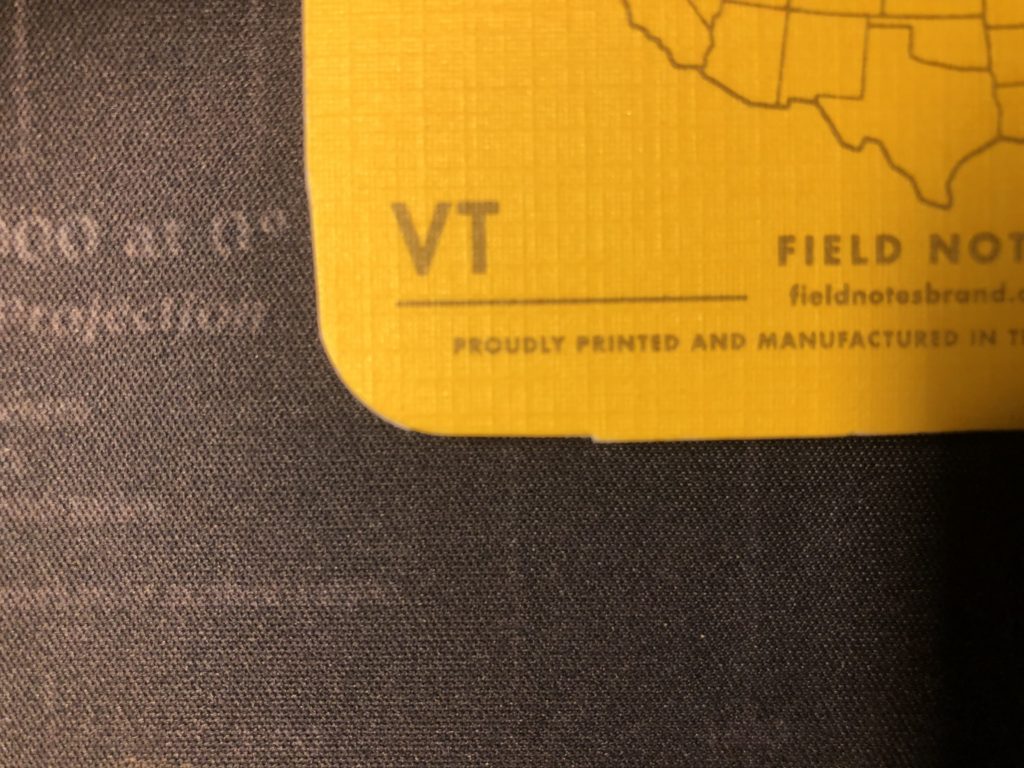
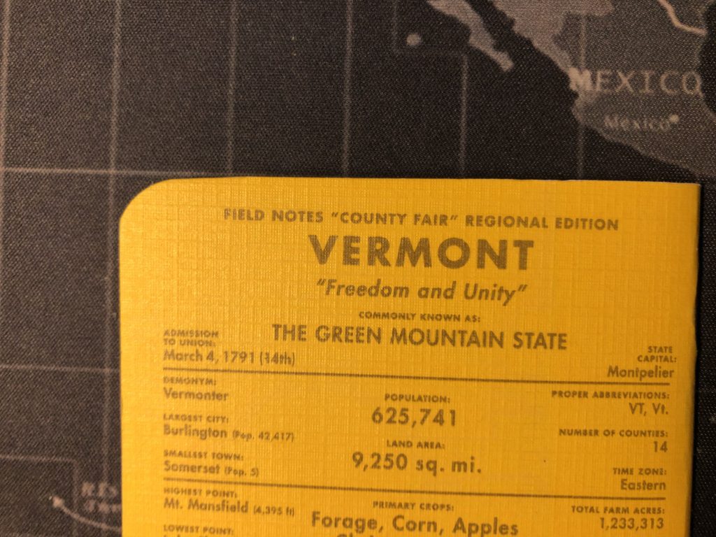
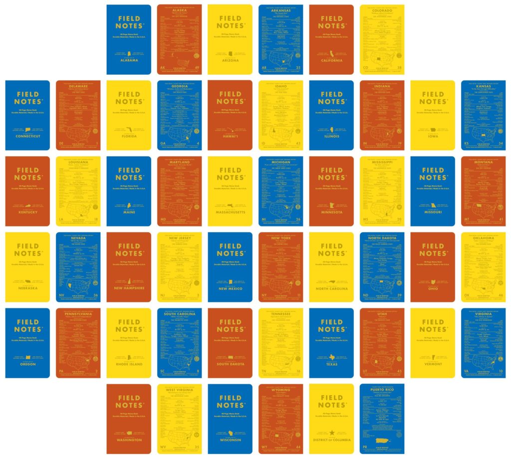
One of the biggest limited editions of Field notes so far was the County Fair. With a pack consisting of a red, yellow, and blue notebook—the colors of state county fair award ribbons—the set could have stopped there and been plenty cool, useful, and packed with the standard amount of Americana FN likes to put into their books. But instead, FN decided to make a set specific to each of the fifty states in the union. And one for the District of Columbia and another—en Español—for Puerto Rico. That’s some class right there. I’m reviewing, naturally, Vermont.

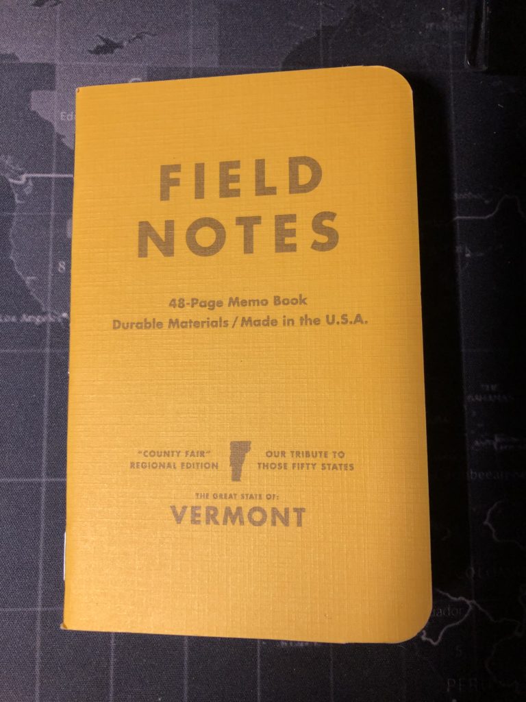
I used the yellow book. The red is slightly orangish, to my eyes. The blue is a crisp bright blue. County Fair was originally a limited edition in the summer of 2010. It was, in fact, just the seventh LE, which at the time was called the “COLORS” editions. But unlike a lot of those early editions, CF proved so popular that FN decided to make it a regular edition. My Vermont pack, purchased in 2019 from FN’s website, shows a “Fourth Printing” from 2014 on the inside back cover. It’s worth noting here that at the time of writing this review, 51 of the 52 varieties are still available from FN’s site, with Indiana being the only sold out edition. No idea if it will be back in stock, but if you’re looking for Indiana or hoping to collect the whole set, loads of third party retailers still carry Indiana.
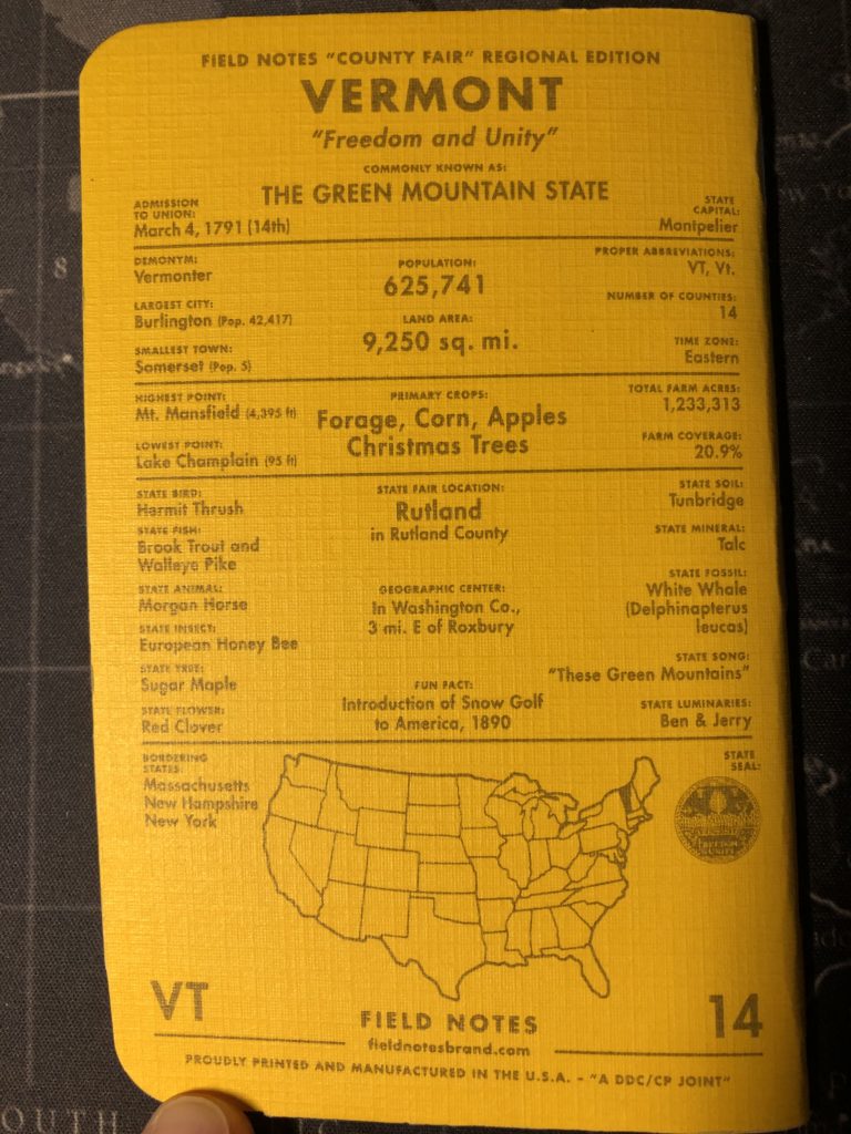
The first thing you notice about these lovelies is the thick 100#C covers with the linen texture. Nice feel to them. The back cover of each has a great listing of state-related facts. Everything from the state’s motto to its state insect. Having lived in Vermont for twelve years when I first got these, I still learned some things—like where the state’s geographic center is (3 miles east of Roxbury, if you were wondering). There’s also a helpful map of the US, showing where the state is on the map. Alaska’s map shrinks the size of the lower 48 so it can also show Alaska. I assume FN did something clever like that for Hawaii and Puerto Rice, as well.
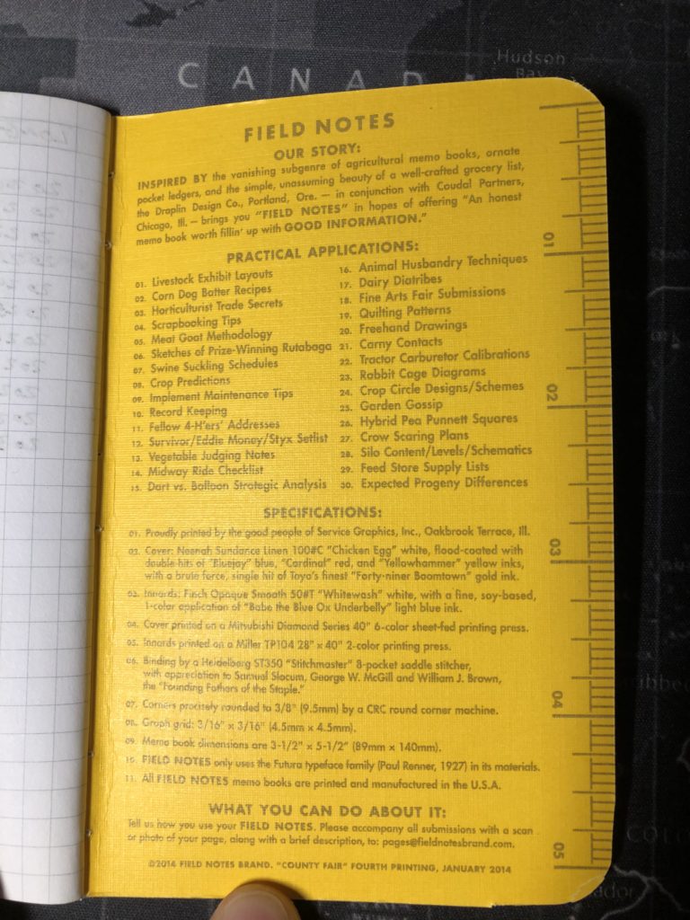
The books have a standardized themed ‘Practical Applications’ across all three colors. The cleverest include things like “Sketches of Prize-Winning Rutabaga”, “Dairy Diatribes”, and “Survivor/Eddie Money/Styx Setlist”. The one unfortunate thing about this edition is that it was in the days when the books were all rounded by a CRC Round Corner machine. Today, FN uses a Challenge SCM Round Corner machine. There’s a world of difference. I noticed the corners were a lot worse on some of the other older editions I’ve used. But this yellow CF is probably the worst I’ve seen.
The interior pages are the older 50#T (white) and feature a “Babe The Blue Ox Underbelly” colored light blue graph, but to my eye it looks like a faint gray. I prefer the 60# page weight but the 50 still holds up well. I tested a Lamy Safari fountain pen, a Pilot Precise Rolling Ball V5, a Baron Fig Squire Rolling Ball, a Blackwing Palomino pencil, a Sharpie Ultra Fine Point, a Staedtler 0.3 Pigment Liner, and a kickass space shuttle ballpoint my daughter gave me. All were fine on the pages—even the fountain pen—with only the Sharpie showing any actual bleedthrough. But as you might expect with the thinner paper, plenty of ghosting was apparent. Not really a problem if you mostly use the right (recto) pages.
I liked the notebook I used, and I really appreciated the bright “yellowhammer” yellow in the dreary late March Vermont weather. I have a New York “Cardinal” red single, and also Alaska and California packs. I’ll probably come back to them. These are great books, and very sturdy, but unfortunately the poorly cut covers detract from an otherwise great edition. One final note of interest: It was also possible at the time of release to purchase an entire box of all 52 books—although just one single from each set. The colors you got in that set are shown in the graphic below, lifted from FN’s own website.
You can still find these boxed sets available on eBay from time to time. There’s one up now, at the time of writing. The cardboard box is also branded with the Field Notes font and a map of the US. The singles some in the box with no shrink wrap, but you also get a blue County Fair boxed set ribbon, and a pin. Plus, one of the FN-branded “Bands of Rubber” and six black click pens. If you’re looking to grab one of those boxed sets, you can expect to pay a premium.
10 Field Notes x Carhartt (Hunting) Review
One of my biggest Field Notes disappointments so far was the collaboration edition from 2016 between Field Notes and Carhartt. It’s a great edition, and you might like it, but it wasn’t for me. Part of my problem was how hard I had to hunt for it. I visited actual Carhartt stores in other states, only to get blank looks from associates who had never heard of these little books. Ultimately, I managed to buy or trade for a pack from someone. I had seen them online, and I thought they looked great with their Carhartt swirl covers and the two-tone colors. I loved that each edition was going to focus on camping, hunting, or fishing—even though I’m not big on any of those activities. But it was still new days for me, and I wasn’t yet well versed in paying attention to the little details on a pack of Field Notes. Once I cracked them open, I discovered that they were ruled and not graph or grid.
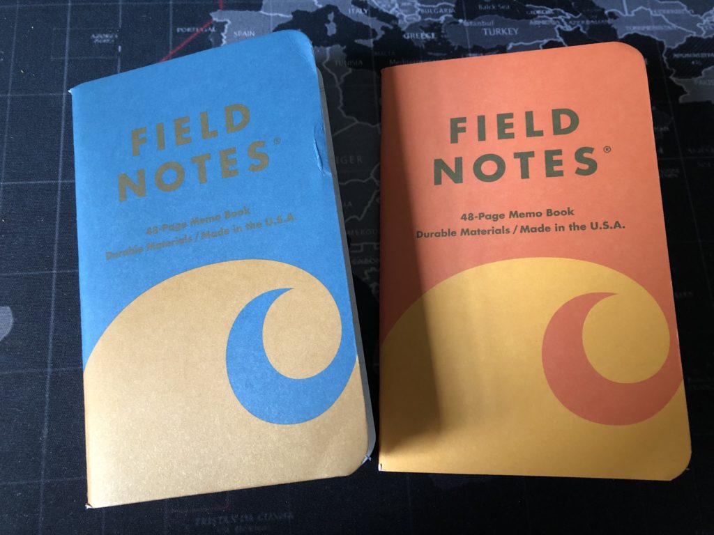
The picture above shows the blue Fishing book and the orange Hunting book. I traded the amazing green Camping book to someone. Those covers are bold. Only 100# but they felt thicker. The pages are 60# but also felt thicker. I loved the beefy feel of these books. Unfortunately, as you can see in the picture, this was also my first pack that arrived damaged, the blue cover having taken a hit on the edge, level with the logo’s ‘NOTES’ line. I was saddened by that, but I was probably going to use the Fishing book last, I thought. Then I saw the ruled innards and set them aside for a while. On New Year’s Day this year, I decided to start a journal in the orange Hunting book, so that’s the one I’m mostly reviewing—even though I abandoned the journal and the book, just a few days in.
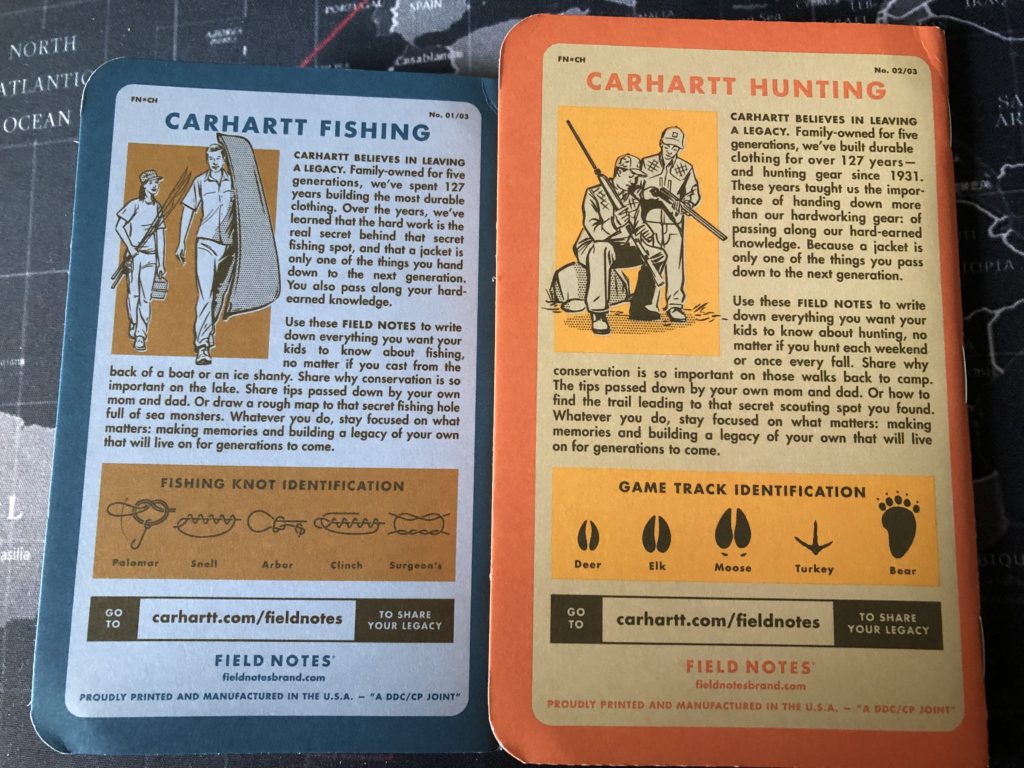
The covers are thick, as I said, and the back cover of each has a nice section of promotional text about Hunting, in the case of the orange book. It also has a little ‘Game Track Identification’ section, and the Carhartt-FN URL, which is now, of course, defunct. The blue Fishing book has a ‘Fishing Knot Identification’ section. The green had a “Toxic Plant Identification’ graphic. Helpful. There are plenty of images of the green Camping book online.

Each of the books also had their own themed ‘Practical Applications’. The Hunting book includes items like “Missed Shot Excuses” and “Flattering Duck Calls”. The Fishing book includes “Impromptu Fishing Permit” and “Brilliant Lure Designs”.
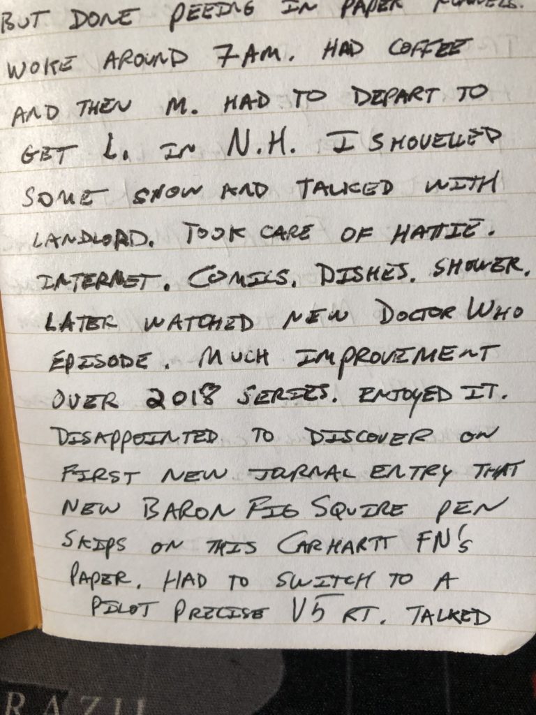
Looking back at these books, I really regret that I’m not a huge lover of ruled books, because these books are nice. But another thing I noticed was that the (at the time) brand new Baron Fig Squire rolling ball pen I’d bought didn’t play well with the Finch smooth paper. As you can see in the picture of my writing sample, the pen skipped at places and at other times left huge globs of ink. Now, in the Carhartt’s defense, I’ve heard from some people that they have experienced similar things from BF Squire pens. Sometimes the Squires get shipped with a bad refill. Changing the refill out might have fixed this issue to some degree. But I suspect the grain of the smooth paper was the problem here. I switched part way through this page to a Pilot Precise V5 and had far better results. There was also a bit of ghosting on these pages.
I recently picked up a Lamy Safari fountain pen to use on these books for the sake of reviews, just so I had yet another pen style to try. I tested it on one of the blank back pages on the Carhartt, and I find that the paper holds the ink nicely with no feathering…but there is a slight bit of bleedthrough if you’re heavy handed. So if you grab a pack of these Carhartt books and want to use a fountain pen with them, I’d plan on just using the right (or recto) pages in the book, with the understanding that your ink might speckle through to the left (or verso) pages. I like the look and feel of these books, and maybe I’ll come back to them again some time and try using just a fountain pen, or maybe a Sakura Pigma Micron, which also worked fine in tests. If Field Notes and Carhartt ever team up again, I’ll have my fingers crossed for a graph paper edition.
09 Lunacy (Crescent) Review
The Field Notes limited edition from the Fall of 2016 was ‘Lunacy,’ and it is significantly different. In March of 2020 I had the chance to dive into one, and what a great experience it was.
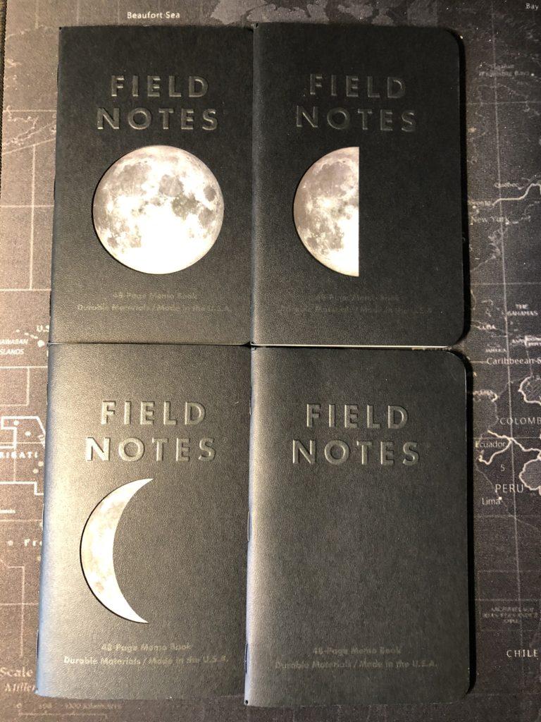
I’d had a 4-pack of these tucked away for quite some time and was dying to use them. And I should note here that the books came in a standard 3-pack for sale on the website, but subscribers got a 4-pack with a New Moon variant. The books, as you can see from the picture, had die-cut covers, and a full color glossy flyleaf (read: and extra page) behind the cover with the image of the moon on it. The effect was that you had a Full Moon (with a complete circle cut in the cover), a Half Moon (with a half circle cut out), and a Crescent Moon (with a crescent cut out). The subscriber New Moon simply had a solid back cover with no cut out. Clever. And of course, the Field Notes logo is on the cover in a varnish black, and the whole thing is banged together with black staples. The effect is lovely. So, if you’re on the hunt for Lunacy now, note that there are 3-packs and 4-packs. If you get a 3-pack but wanted the 4th ‘New Moon’ book, some people will sometimes sell that subscriber book separately—but often at a premium.

I chose the Crescent book. It looks really cool, and I was keen to get it out of my collection, since the die-cut cover would often snag any other book I tried to slide into the box in front of it. Also, this edition did not come with a belly band—in either 3-pack or 4-pack variations, but they did come shrink-wrapped with an insert at the back, like the recent National Park packs.
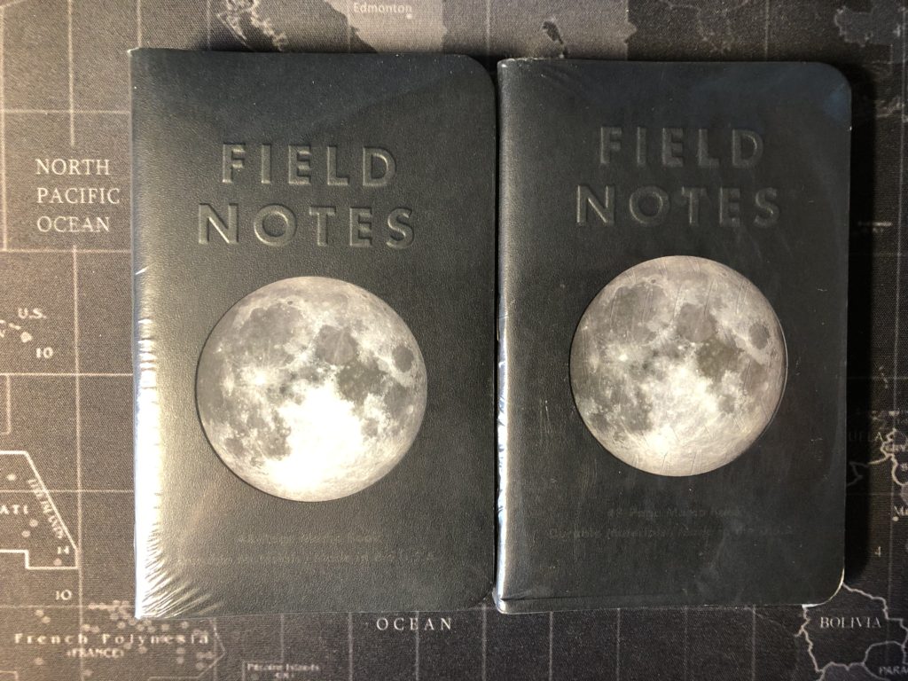

The design of this set is a class act all the way, with 100# thick covers. A lovely silver for the fields on the inside cover—but the ‘Pertinent Coordinates’ section is missing because of the die-cutting process. So, the ‘For Internal Records’ section was moved up above the cut. You’ll need some kind of a special pen to write in these silver fields. I went with the Sakura Gelly Roll in white, with a .5mm tip, and it worked beautifully.

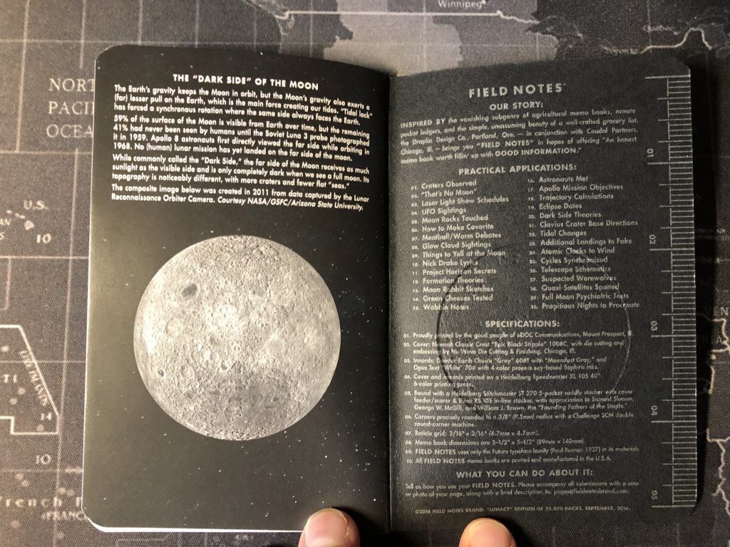
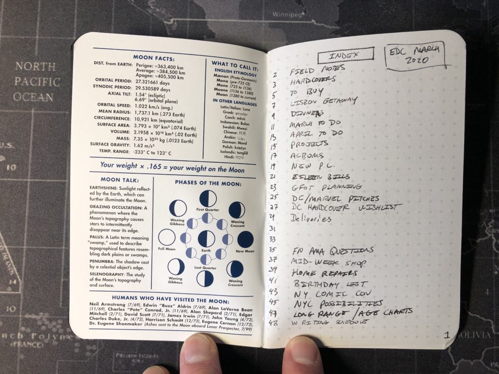
The back cover deserves a word here, as well. It features an embossed image of the moon—and that means the inside back cover has a debossed image of the moon over the ‘Practical Applications’ and ‘Specifications’ sections. But they are still legible in silver font. Those ‘Practical Applications’ are themes and include such doozies as “That’s No Moon”, “Additional Landings To Fake”, and “Suspected Werewolves”. The Flyleaf is full color, and in addition to the front’s illuminated moon photo, the back flyleaf shows a picture of the dark side of the moon. The inside of the flyleaf is packed with great moon lore from facts and etymology, to how to calculate your weight on the moon, a phases of the moon chart, a list of humans who have visited the moon, names from cultural folklore for phases of the moon and seasonal moon names, to a collection of the solar system’s moons image, and even information on how to kill a werewolf—no, really.

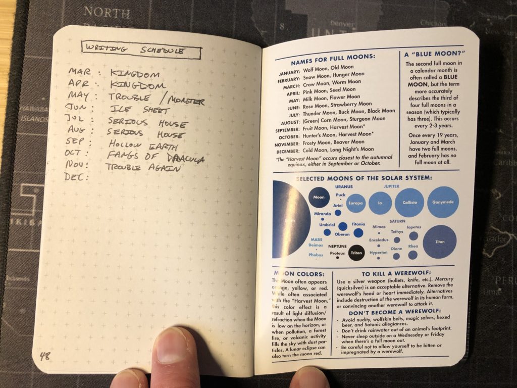
The books innards are not even just the same old 60#, but rather they are washed with a ‘Domtar Earth Choice’ gray, with ‘Moondust’ gray reticle grid. They are subtle enough, but against the gray paper, even more so. I used a Baron Fig Squire and a Pilot Precise V5 on this book, and an interesting thing happened. The gray wash over the 60# pages meant virtually zero ghosting. My first pocket memo book with no ghosting whatsoever. And of course, also no bleedthrough. In short. I loved these pages. Thinner than a 70#, but with the gray wash, nothing showed through these pages. And despite the die-cut cover, the book held up well to three weeks of use on my desk or in a DDC Stuff Sheath when it needed to travel with me.
Overall, I highly recommend this book, if you can tolerate a reticle grid. If you’ve never used one before, I’d say to give this great book a try. It looks great, wears well, and the pages were perfect. Plus, who doesn’t want all those great werewolf factoids. Never know when those will come in handy.
08a Pitch Black (Note Book Size) Review
I’ve previously reviewed the Pitch Black edition from Field Notes. Or, at least, I had reviewed the memo books called Pitch Black. The memo book size (3½” x 5½”) is the standard size for most Field Notes books. In the case of the Pitch Black release, the books were released in two different sizes and with either ruled or dot-grid innards. Having reviewed the smaller sized book, I figured that was enough to cover the entire release. I even mentioned this larger size (4¾” x 7½”) and how easily even vendors could mix up the “memo book” vs. “note book” sizes because of their similarity. But after writing that first review, and after actually receiving this larger version, I realized there was a lot more to the larger books you might want to know about.

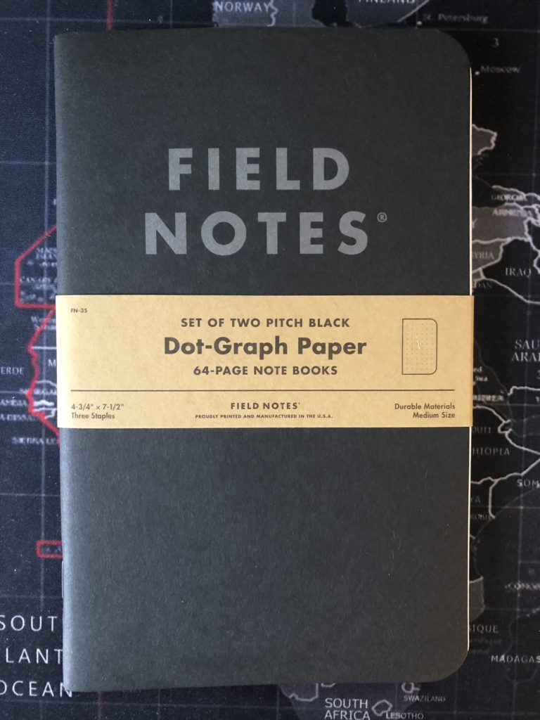
First off, I haven’t used this Note Book sized PB. But I’m assuming for this review that the innards, which are still the same 60#, will act the same as the Memo Book paper. There are also only two of these books in a pack, rather than three. The covers for the larger books are still the same thick 118# duplexed Black and Kraft Brown. Size-wise, these books are the same dimensions as the recently released 5E Character Journals for role playing, if you snagged any of those. (Although note that the 5E books are quite a bit thicker because they contain a 70# paper vs the Pitch Black’s 60#.) I’ve also got a photo of the PB Note Books against a Baron Fig Vanguard, if you’re familiar with those.

The inside covers of this larger size of the Pitch Black are where everything changes. It stands to reason, I guess. Larger inside covers, more room for additional content. And Field Notes packs it in. The standard sections on the inside front cover are enhanced and expanded upon. There’s a metric ruler. The ‘Property Of’ block contains check boxes for an honorific. The ‘Pertinent Coordinates’ block has lines prompting “street, apartment, city, state, zip code, and telephone number.” The ‘Internal Records’ block is divided in two, as is the ‘Misplacement’ block, and they’ve even tossed in a saucy comment. The entire inside front cover is bisected with a “24–7–365, 366… whatever it takes, Field Notes is there for you” tagline (which misuses the en-dash twice but I’ll overlook it because of what follows). The lower half of the inside front cover features a section called ‘Bring on the Night’. It’s packed with great information and a chart to give you an idea of how many hours of daylight you can expect, any time of year and at any place on the globe. Finally, there’s a promotional line and the URL at the bottom.

The back inside cover still features all the sections on the memo book, and it includes the exact same list of ‘Practical Applications’—seems like a missed opportunity to me. However, there’s also the inclusion of Pitch Black edition-specific tagline: “‘Pitch Black’ – The Darkest Place for Your Brightest Ideas.” (There’s that pesky en-dash again.) Following that, there are side by side sections on ‘Fight Insomnia’ and ‘Stay Up All Night’, themselves bisected by a minimal clock graphic. Then, bizarrely, there’s a ‘Characters in Ray Bradbury’s Something Wicked This Way Comes’ section used as a dividing line to separate the new sections from the ‘Specifications’ and a newly added ‘Black Is Black?’ section. All of these new additions are wonderful, and entertaining, which is all you can ask for, really. Finally, this version of the Note Book does not lists its year or printing number.
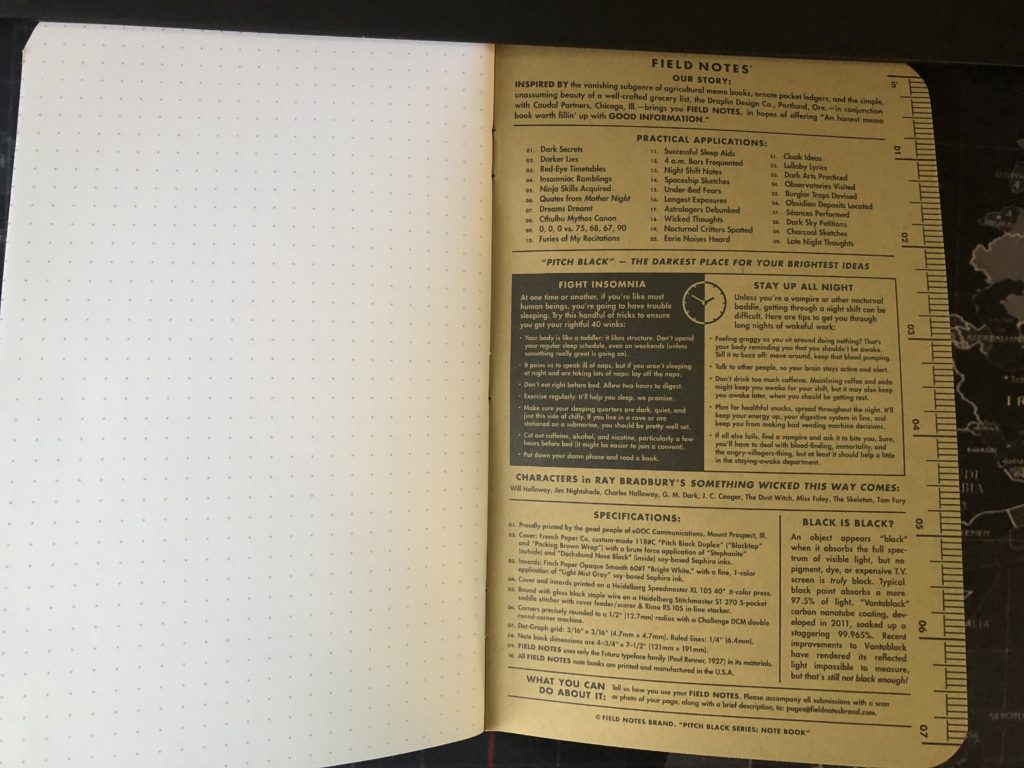
Overall, I was thrilled to discover this extra content, and I’m eager to give these larger sized books a try. Since they come in both ruled and dot grid, unless you’re limited to graph, you should check them out. They’re fun, and they’ll be a slightly different experience to what you’re used to with the memo books.
08 Coastal: East Review
After my brief dalliance with Elemental Papers last time, it was right back to Field Notes for me. I had long had my eye on the very eye-catching Coastal edition, which came in two flavors: East Coast and West Coast. Each pack of memo books consisted of three books stamped with foil on the covers, which when lined up, form the coastline of the United States. I chose the East Coast, and used the first book in that set, which shows the coastline from Maine down through New Jersey. This was a natural first choice for me, having been born on New York’s Long Island—which features so prominently on the cover.
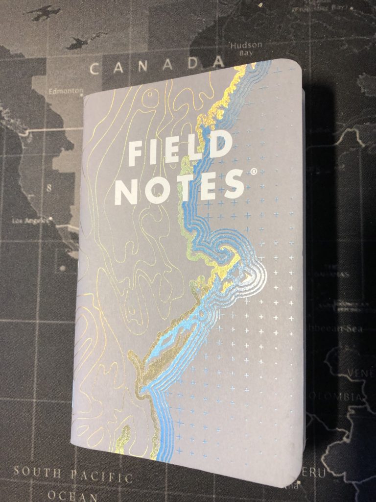
This is a really beautiful edition, with thick 100# covers stamped and slightly debossed with a gold and blue foil that shows the contours of the coast along with the blue reticles showing the water spaces on this impromptu map. The colors really pop against the ‘Cadet Gray’ of the cover, and the white text also jumps out at you. Interestingly, the foil shifts colors in different light, which is wonderful. My one dislike, and it’s a minor one at that, is that the foil-stamped image wraps around to the back cover, but does not entirely fill the back cover. It should have.

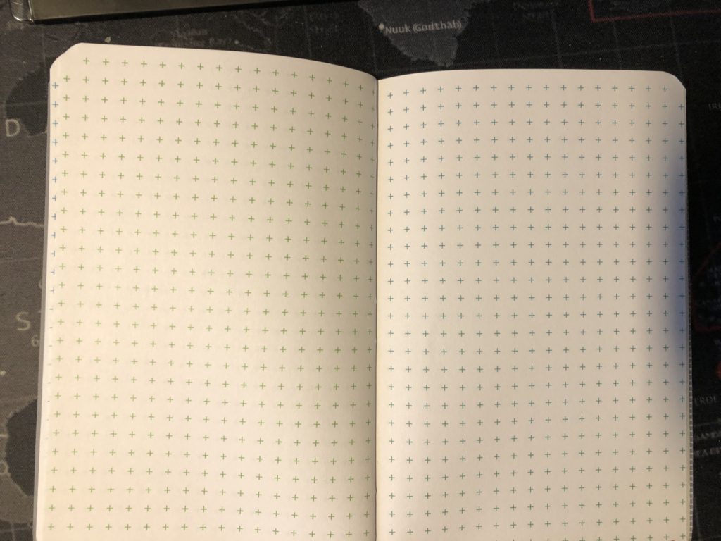
The inside of this edition is, I suspect, where most people who disliked it—or will—will have encountered their problem. The 60#T paper is bright white with alternating pages of green or blue reticle grid. I personally didn’t have a problem with the colors of the reticles, for a reason I’ll get to, but the shades of green and blue inks are very bright and certainly could have been muted some.
In my case, I chose the Coastal as the perfect opportunity to try out a different pen. The Editor limited edition Squire from Baron Fig—with bright red ink. So, as the pictures will show, my red ink really stood out against the green and blue reticles, despite them being bright. I’m not sure how well a black or blue ink would have fared, but I’ll test out black when I try this edition again.

The back inside cover features the standard sections, but does have an East or West (depending on the book) themed Practical Applications. The most amusing of which, in my opinion is a “Why Portland, ME Is The Best” item in the East Coast books and a “Why Portland, OR Is The Best” in the West Coast books.
The cover wears quite well and the paper held up fine with my red ink, with some ghosting but no actual bleedthrough. I enjoyed the edition and would use it again. It was durable, beautiful and functional, which is really all we can ask of a little pocket notebook.
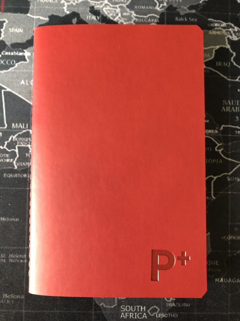
07 Elemental Proton Review
I became a Field Notes convert in the summer of 2019. I very quickly started buying notebooks like crazy, but I was also very brand loyal. Field Notes all the way. I had seen the Kickstarter for a little notebook company called Elemental Papers, and their A5-sized hardcover ‘Oxygen’ notebook, based on the elements of the periodic table, looked very cool. However, I’m not a science guy per se, and I didn’t want the larger notebooks after falling in love with Field Notes’ pocket-sized options. So, I was going to pass. I later found out that Elemental had in fact done a pocket-sized pack called Unobtanium, but they were now very scarce. But then, at the end of January 2020, Elemental introduced the Proton—a new memo book sized item, and I had to grab some and try them out.

I have to say, one of the things that grabbed me about Elemental is their packaging. It’s pretty slick. They clearly put a ton of thought into the design of their books (and I’ll talk more about the others in their line, below.) The Proton memo books, like Field Notes, come in a set of three, and they are the same size. But right about there, the comparison ends. Most notably because the books come in a beautiful foil-stamped slipcase, the back of which is packed with information about the company, the books, and a Proton.
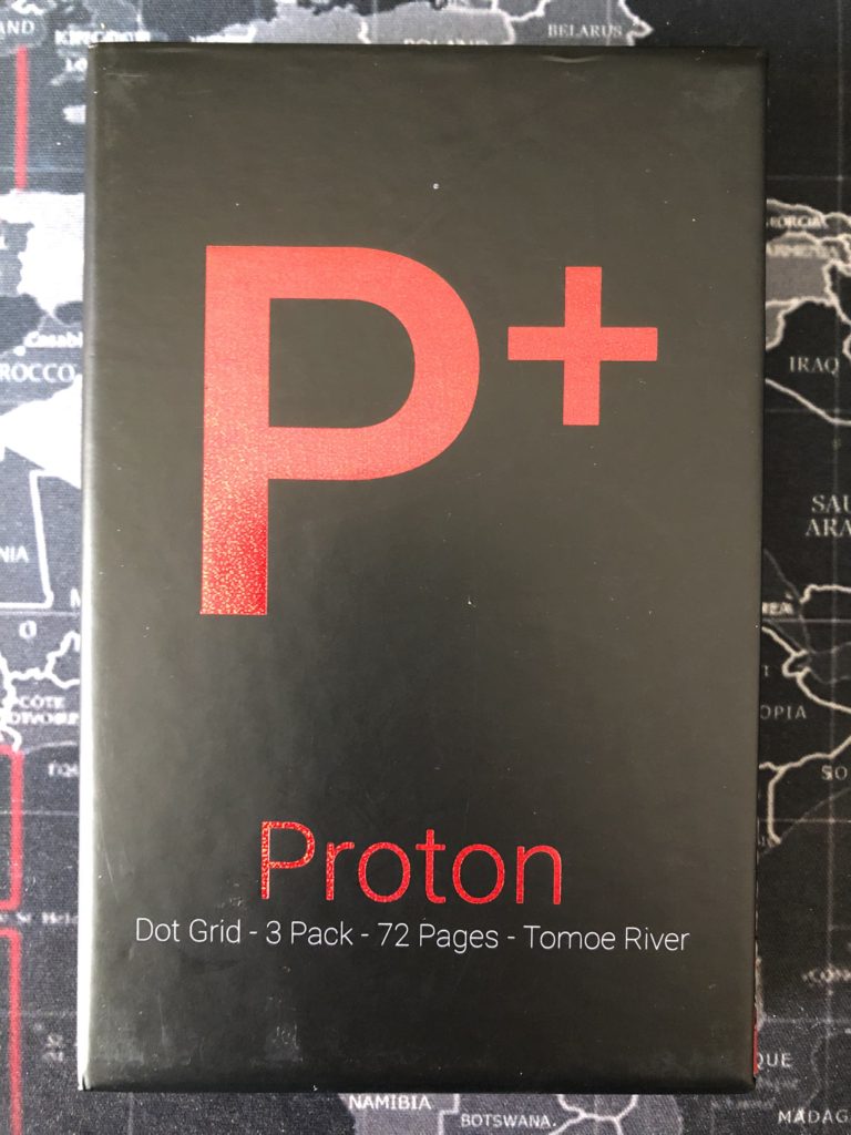
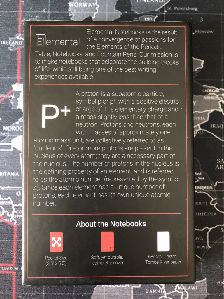
At 72 pages per book, that’s also quite a few more leaves than FN’s standard 48 pages. Elemental also chose purposely to go with a 68GSM Tomoe River paper, in an attempt to be more fountain pen friendly. I’m not sure how friendly it actually is (because I don’t use a fountain pen), but, do note here that GSM refers more to a page’s density than to the thickness of the page. The company doesn’t list the actual thickness on their site, but I’d guess, based on feel, it’s close to one of the Field Notes’ 60# papers.
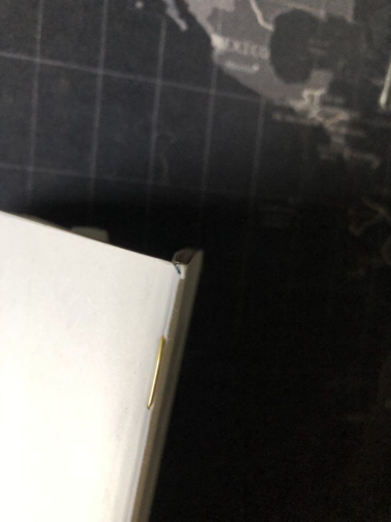
The covers are a thick red ‘leatherette,’ deeply stamped on the front with the ‘P+’ symbol on the front of the book, and on the back with the company’s distinctive logo. Also, rather than being stapled, these books are stitched with a thick gray thread. As Elemental says, “You get to celebrate Stitch Day instead of Staple Day.”
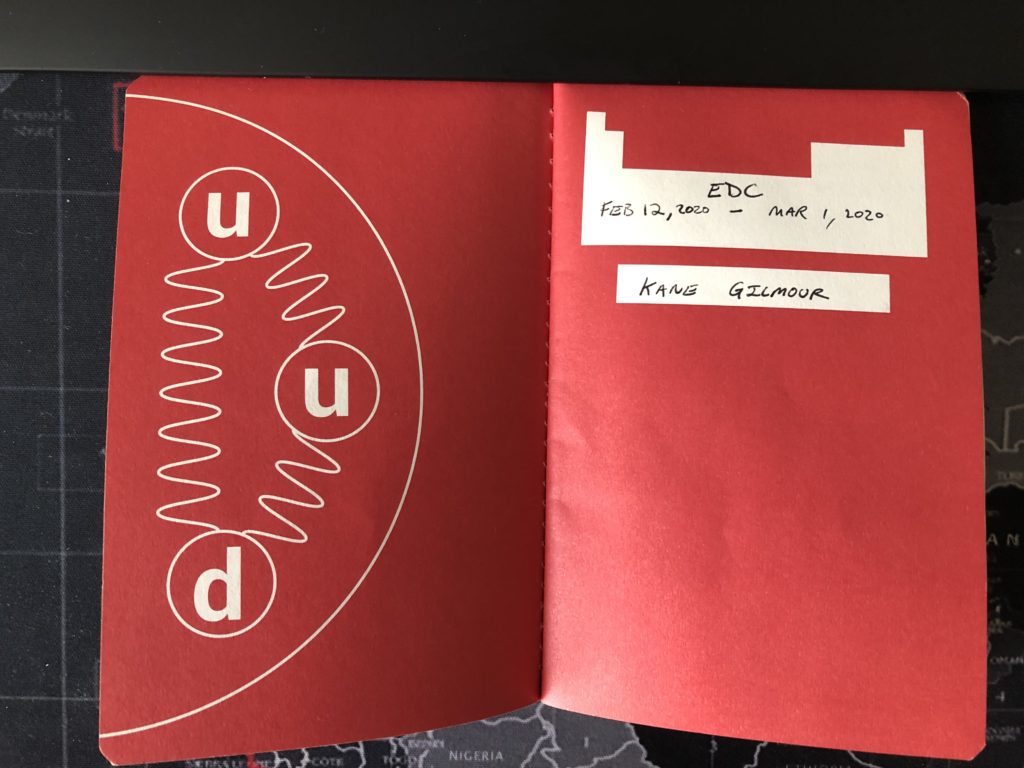
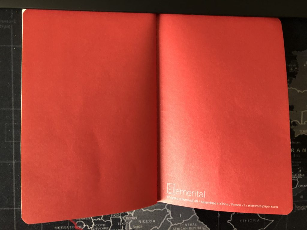
The inside covers feature a splashy red endpapers—the front with a blank periodic table for you to write your info in, and a diagram of quarks and gluons, while the back is a simple and tastefully small company logo—quite reminiscent of the Baron Fig (now Baronfig) approach to branding.
The cover wears extremely well, as you might expect, and I used this book a lot longer because of the increased page count. I mostly used my Baron Fig Clear Habit Squire rolling-ball pen on this book. The paper was thick enough, with no bleedthrough at all. But there was abundant ghosting through the pages. Also, the color of the pages was a cream rather than a straight white and for some reason it was a little off-putting. Dot-grid marks in gray on the interior, so if you’re a grid hater, this book won’t be for you. As my third time using a dot-grid page, I finally really got into it, but my handwriting is still a bit sloppier without the rigidity of a full graph. I did really enjoy using this book. So much so that I quickly went and bought more packs to squirrel away. Elemental had stated when they released Proton, that they hoped to also make an Electron pack and a Neutron pack. They have since announced that this spring would bring the Electron—with a blue theme, and a strange hybrid between a ruled and a dot graph page that looks a bit like Morse Code. Despite my distaste for ruled books, I’ll still be buying and reviewing them when they are released. At the moment, Elemental has only one product for sale on their site—the Proton. If you like dot grid, I’d highly advise you give them a shot.
I should also mention that I liked the Elemental book so much that I quickly went out and found as many copies of the A5 notebooks that I could. Themed after elements, the larger hardcover books are a class act, in their own themed slipcases, with the element’s emission spectrum printed on the textblock edges, twin ribbons, and great paper in a hardcover that lays flat. They started with Oxygen, Hydrogen, Carbon, and Nitrogen—all of which sold out quickly. Then a stunningly beautiful purple Iodine notebook also came and went quickly. Also, at some point in the spring (or possibly later depending on COVID-19 delays, we shall see) the company is planning to release a Uranium notebook, the dot grid on which will fluoresce under blacklight. If these books are sounding good to you, I’d say nab them as soon as they are released. Iodine didn’t last long. Proton packs are still available on the company’s website—about 500 of them at the time of writing. They have a helpful countdown timer on the website showing how many copies of a give book (or pack) they have left in stock.
While I might seem to be the biggest fan of Elemental Papers with this review, and I even managed to overcome my guilt about leaving Field Notes for a single turn (before quickly going back to them after my Proton was full), I do have one negative to mention here. While they ship their orders very quickly—and I know the company is just a husband a wife team of Greg and Laurie Krumm—the packaging on their shipments leaves a lot to be desired. For such high-end notebooks, that come in beautifully crafted slipcases, the packaging, which consists of a single cardboard box and a scraggly piece of brown packing paper, is hardly sufficient. One of my orders suffered pretty bad corner bumps to the slipcases. I sent an e-mail to the company, mentioning the damage, and the anemic packing material, and good naturedly mentioned that I wasn’t looking for a replacement or a freebie (although let’s not kid ourselves, folks, I would have loved a freebie of some sort). I just contacted them with photos and mentioned how insufficient the packing material was. I received: no response at all. I was disappointed, but not enough to stop buying their products. Just be warned that the packing is poor, and if you do get a damaged shipment, you might have to be a little aggressive to get some satisfaction.
06 Group Eleven (Gold) Review
After using—and loving—the oldest Field Notes memo book I had in my collection (at the time), the Cold Horizon, I switched it up and used the newest one in my collection. The winter 2019 edition of Group Eleven. That edition was based on three metal elements of Gold, Silver, and Copper, and each notebook in the pack of three was themed after one of those elements with ‘Solar white’ covers featuring foil-stamped letters, gilded edges, and color-coded staples. I went with the Gold, so my single had gold staples, gold foil, and gold gilded edges.

One thing a lot of people complained about with this release was that the Silver books in the packs often appeared to be trimmed a bit shorter than the other two, and the corners of the books were often torn—even still in the packaging. As a fairly new user of Field Notes brand memo books at that point, I had noticed badly dinged corners in loads of books across editions, and just assumed that was going to be an unfortunate feature of any FN brand books. I think with the Group Eleven, because the books looked so nice with their gilded edges, it was that much easier to criticize any physical flaws.

These are still beautiful books, though, with thick 120# covers that are a brilliant but smudge acquiring white on the outside, with ‘Epic Black’ inside covers. Oh, and the text inside the covers corresponds to the element, as well, so this one had gold text. The covers feel really thick, and the combination of the thick covers, the thicker paper, and probably the gilding make these books not want to stay closed. The inside cover was easy to write on—assuming you have a white Sakura Gelly Roll pen or something similar, because with the black cover, you need an ink that can pop.
The cover wears pretty well, but as I mentioned above, it can acquire smudges. This book was mostly on my desk, and I washed my hands several times a day, even before this pandemic. The coner was ripped a bit, right out of the package, but otherwise the edges and material held just fine throughout use. The back inside cover has the standard ‘Our Story,’ ‘Specifications,’ and ‘What You Can Do About It’ sections to be found on most standard books. In addition to those, the book comes with the Gold-themed ‘Practical Applications’ that you can see in the picture. My favorite was “Things to Tell Ponyboy”. And a special mention here of my favorite Practical Application on the Silver book, which I read, even though I did not use. “Norrin Radd.” That one cracked me up. Also, the inside back cover has a tiny section squeezed in of facts and info about Gold itself. A nice touch.
In addition to the Gelly Roll pen for the cover, I mostly used my Baron Fig Clear Habit Squire rolling-ball pen. Group Eleven’s paper, at a delightful 70#T, was plenty thick for the pen, with no bleedthrough and practically no ghosting. Also, of note, the color of dot-grid marks was different depending on which of the three GE books you used—again, in this case the ink was a very faint gold. This was my second time using a dot-grid page, and I do consistently find that my writing is sloppier with it versus the full graph. However, I still really enjoyed using this edition. The gold theme certainly made it feel special. I’d love to see FN stick with the 70# paper as a minimum thickness moving forward, but unfortunately, the spring 2020 edition—Vignette—reverted to a 60# paper.
Should you crack open and use a Group Eleven? If you like dot-grid, absolutely. As one of the most recent editions of the FN books, it should still be widely available, and the metallic themes really do make the books feel special, and using them has that feeling as well.
One final note of interest on this edition is that the name was originally going to be ‘Elemental’ and that seems like an obvious way to go, in retrospect. However, in the process of production, the FN team found out there was another notebook company called Elemental Papers. The edition’s name was quickly changed to Group Eleven—and FN was kind enough to post a Dispatch on their website explaining what happened (and why the inside back covers of the books still says “Elemental” in the edition info at the bottom). FN also highlighted Elemental Paper’s efforts and gave them a boost in sales for the error. Very cool. While it’s just a tiny footnote for this edition, it is nice to see that analog solidarity across companies. And it’s relevant also because of the next pocket memo book I’ll be reviewing: The Elemental Papers Proton.
05 Cold Horizon (Frozen Steel) Review
I actually quit the last Field Notes memo book I was using—the Black Ice (see that review for why). It was mid Jan 2020, and I needed to jump into something else. Something not ruled. Something pleasant to look at. By that point, I had amassed a small collection with a few rarities I was eager to try out. I selected Cold Horizon, the FN limited edition from winter of 2013. At the time, it was the oldest edition I had. When I dove into the pack, I noticed that the blue gradient covers were in three different patterns: “Arctic Night”, “Glacial Pool”, and “Frozen Steel”. I picked the latter simply because it appealed to my personal aesthetic the best, starting as it does, with a lighter color near the spine and transitioning to a deeper blue at the right-most edge of the front cover.
These are beautiful books, with the entire 120# cover a gradient of blues that are UV coated for a high sheen of gloss. The bright white text really pops against that background. Also, if you put the three books next to each other, the color gradient flows across all three covers. Clever. The white inside cover, while slightly glossy, is not as bad as the Black Ice covers, but writing on them was still a bit challenging, and created slight indentations in the front cover. One interesting thing, which I’m only noticing now, while reviewing the book, is that the text on the inside covers, is also a gradient of blue ink!

I really enjoyed the look of this edition throughout my use of it, and as far as wearing goes, this one held up very well. However, during its use—in January in Vermont—I was mostly at home, so the book didn’t travel much or get used in more places than on my desk. The back inside cover has the standard ‘Our Story,’ ‘Specifications,’ and ‘What You Can Do About It’ sections to be found on most standard books. But, Cold Horizon comes with winter-themed ‘Practical Applications’ such as “Jack London Quotes,” “Mittens Lost,” and “Moose Close Calls.”

Looking at the weight of the lines of ink in this memo book, I can determine that I used my trusty Pilot Precise V5 (with extra fine tip), and also a click-top RT version of the pen. I also used my Baron Fig Clear Habit Squire and the Editor Squire—which comes with red ink. Cold Horizon’s paper, at only 50#T, was a lot thinner than what I had come to expect from a Field Notes book. Also, of note, the color of the paper was different depending on which of the three CH books you used—either a “light green, light blue, or cool gray” page with a very light gray graph grid. The ‘Frozen Steel’ book is the one with the light gray pages. As expected from 50#, there was considerable ghosting. Just the tiniest amount of bleedthrough from heavy pressure points on the pages. Even still, this edition was a joy to use—partly because of the older nature of it, and partly because of the design. I’d love to see a resurgence of this edition, maintaining the gradient ink, but with a far thicker cover, and maybe a 70# paper.
Should you use a CH? If you like graph, I would say yes, for sure—if you can get your hands on some. As this was a 2013 edition, it is becoming harder and harder to find. Current prices on eBay are ranging from $40 and up. Looking back through my trading notes, I see I had traded a pack of Clandestine and a pack of Workshop Companion to get my hands on a pack of CH—which, based on present day prices of those, is about the same forty bucks. Expensive. But the book was a joy to use. I traded the ‘Glacial Pool’ single from the pack to someone, and I still have the ‘Arctic Night’ single for future use (as well as another whole sealed packed tucked away somewhere). Get it while you can.
04 Black Ice Review
I abandoned my previous pocket memo book before it was full, because I needed to jump into something else for emotional reasons. New Year’s Day of 2020 I jumped both feet into a ‘Black Ice’ limited edition memo book from Field Notes. I had been lusting after this beauty for quite some time, and I’d finally got my hands on it. This edition was a little different from past editions for FN, and for me it was also my first attempt with a ruled pocket notebook, as opposed to graph or grid. The cover of this edition says it all: a shiny metallic reflective surface with a bright pop of orange down the spine.

The entire 100# cover is stamped with a metallic foil of silvery-black. And that jaunty orange band at the spine? It extends to the inside covers as well. The only problem with that orange is it’s a ‘soft touch varnish,’ which is another way of saying glossy. That made writing on the inside front cover a little dodgy—especially with a rolling ball pen. The other unique aspect to this edition was a PUR-binding with an adhesive that’s stronger and more flexible than a regular perfect binding. I decided to put that to the test immediately, with page 1, and you can see the results in the picture. I found the book was easy to smash flat, and while the inner pages did not easily stay open, the covers were happy to. Although I had many other grudges with the book, the binding was not one of them.
(What appears to be bleedthrough on the Index page is in fact smears from the ink taking forever to dry on the inside front cover.)
This shiny cover gets smudgy fingerprints on it quickly, as you might imagine, and another unexpected ‘wearing’ issue was due to the need to write a little harder on the inside cover, pen tip marks can be seen as indentations on the front of the cover. The back inside cover has the standard ‘Our Story,’ ‘Specifications,’ and ‘What You Can Do About It’ sections to be found on most standard books. However, Black Ice comes with its own winter-themed ‘Practical Applications’ list. Highlights for me were “Bruised Tailbone Counts,” “Shackleton Caches,” and “Plunges Polar-Beared.” The back cover is the same shiny surface as the front but also scuffed quite easily—and as readers will know, I tend to go very easy on my books, with some looking brand new when I’m done with them. That makes the Black Ice pretty scuff-prone, in my opinion.

I used a Pilot Precise V5 Extra Fine tip pen on this book, and I also utilized my first Baron Fig Squire Roller Ball pen, the limited edition ‘Clear Habit,’ on this Field Notes bad boy. For those who have not seen a Squire yet, the ink is definitely a lot wetter than the Pilot, but when it’s flowing, it hits a page beautifully. Black Ice’s 70#T paper had a surprising amount of ghosting—especially since the paper was thicker than the previous books I’d used. No actual bleedthrough of the ink, though—with either pen. The ruled lines are in a “Frost Gray” (with two Ledger style orange lines at the top of the page). The ruled lines were not too obtrusive, but I did find that the double-ruled header space felt annoyingly bright for me, and also as if it wasted a goodly amount of space on a page. Also, my writing was far larger and sloppier without the rigidity of a graph or grid, and that wasn’t just down to my use of the Squire. This was my first, and possibly last, use of the ruled pages in a Field Notes pocket notebook. I just didn’t love it. While the pack clearly shows the books to be ruled in the tiny graphic on the belly band, that also came as a surprise to me. I guess I just hadn’t paid that close of attention to it until it was time to use it.
This one was a weird experience for me. I disliked so much about the book, even though I had yearned for it until it was in my hands. Some ‘Field Nuts’ adore this edition—Bill Black of Huckster Truck comes firmly to mind, since every mention of this edition in the Field Nuts Facebook group is usually accompanied by Bill popping up and declaring “#BlackIce,” hashtag and all. The edition is clearly beloved by many, but it was my first full Field Notes disappointment. Your mileage may vary.
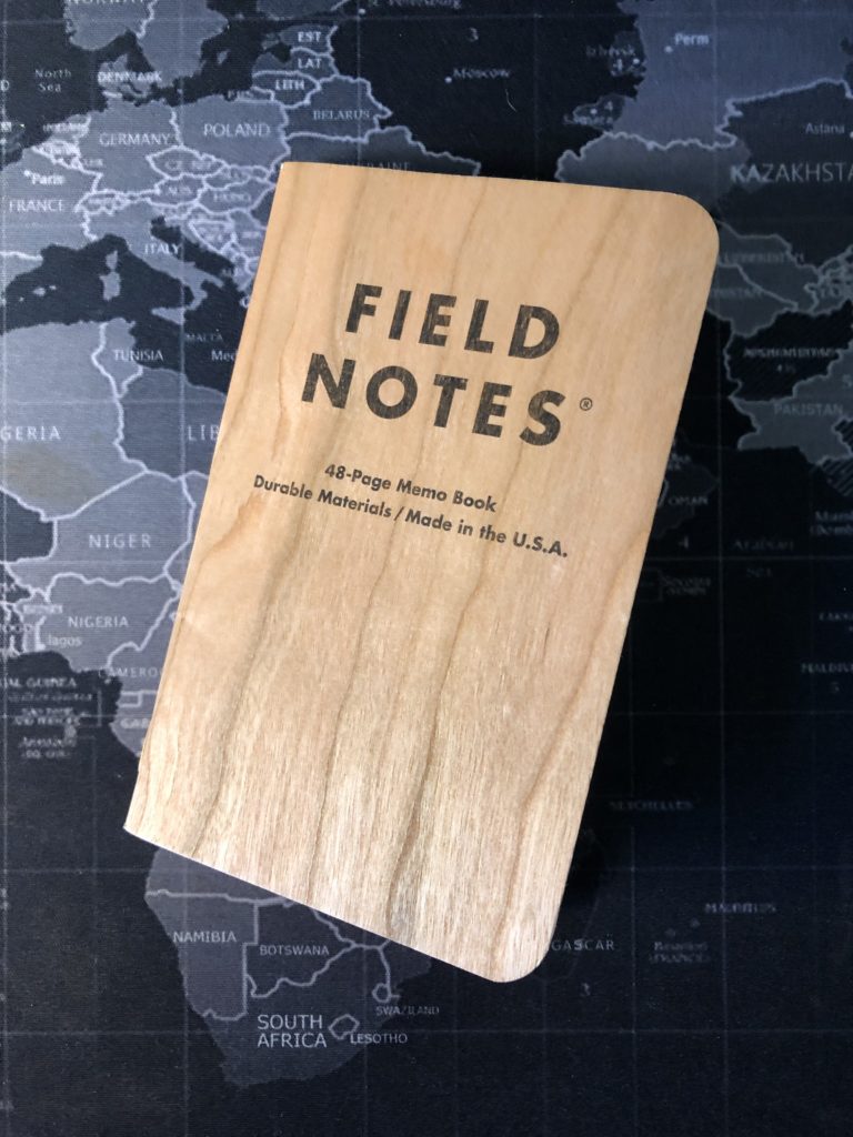
03 Pitch Black (Seventh Printing, 2017) Review
After using a Field Notes brand ‘Green Wednesday’ and a ‘Cherry Graph,’ I slipped into a ‘Pitch Black’ memo book next. It fit my mood at the time, as my mother had died, and I was dealing with her affairs in Florida—separated from my family for a month to handle those things. But what I really liked about the PB was its thick duplexed cover. And it was my first experience with a dot grid paper. I used it for a month, and it weathered pretty well.

The cover is, as I said, duplexed. It’s technically a 118#C with black on the outside and kraft brown on the inside. Note in the title of this review that this is the seventh printing of Pitch Black. I’m not sure what other differences existed on previous versions (or latter versions, if there are any further printings), but I have since acquired older, still sealed, editions that lack the Pitch Black book icon on the back cover and that have a different colored belly band. Other differences might exist between printings (and I’m hearing that on the older editions, the black cover is duplexed onto a black inner cover as well, but I have yet to see this). This seventh printing held up well to constant use in the humidity of Florida, and even rode in a back pocket a time or two, acquiring dents and ‘character.’ The back inside cover has the standard ‘Our Story,’ ‘Specifications,’ and ‘What You Can Do About It’ sections to be found on most standard books. However, Pitch Black comes with its own darkness-themed ‘Practical Applications’ list, many of which are quite good. Highlights for me were “Ninja Skills Acquired,” “Eerie Noises Heard,” and “Obsidian Deposits Located.”


I used a Pilot Precise V5 Extra Fine tip pen on this book, and the pages took the ink just fine. The inside cover, being Kraft, was easy to write on with a black pen, and the text showed up nicely. 60#T paper had very little ghosting, with no actual bleedthrough of the ink. The dot grid in a “Light Mist Gray” was never too obtrusive, but I did find that my writing was slightly sloppier without the rigidity of the full Graph I used on previous books.
I also abandoned this book before it was full, as I was itching to try others, and also because the fact that this was the book I was using in FL while dealing with my mother’s estate meant, once home in Vermont, I wanted to see a new book every day that didn’t remind me of that experience. I’ll happily go back to a Pitch Black in future though. The paper was good, the thick covers were great. And I got used to the dot grid just fine. I’ll even say that so far it remains one of my favorite editions, and happily it’s a regular product from Field Notes and not a limited edition.
One note of interest here: Field Notes has made two sizes of Pitch Black. The standard memo book (3½” x 5½”), which can come in ruled or dot grid and also a larger ‘note book’ size (4¾” x 7½”), which is the same size as the recently solicited D&D 5E Character Journals. These Note Book sized books also come in ruled or dot grid. So, if you hate dot grid but can get on with ruled, you can still try these great books out. However, be aware of the size differences and terminology differences of ‘memo book’ vs ‘note book’ and also realize that 3rd party vendors might not be able to keep those differences straight. I recently ordered a ‘note book’ pack from a 3rd party vendor, because I wanted to try out that larger size, but I received a ‘memo book’ pack. One assumes that if you order direct from Field Notes brand, they’ll keep that difference in mind. One other oddity of the dual sizes? Both packs are the same price, even though you get more paper real estate in the larger note book format. So, lots of variation in what’s available, but no matter what, the edition is winner in my book.
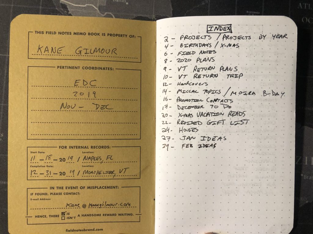
02 Cherry Graph (Second Printing, 2016) Review
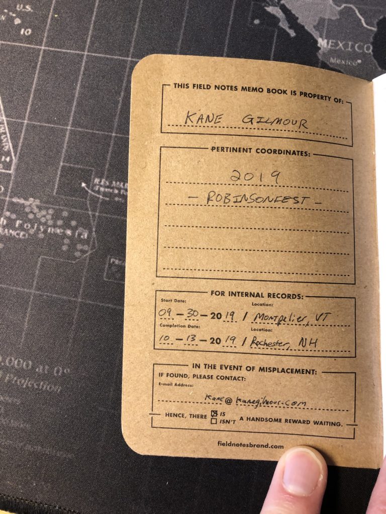
My first Field Notes EDC memo book was the Green Wednesday, and I really enjoyed it. But before I even completed it, I started a second memo book from Field Notes to use exclusively for an event I plan and run every year. The event is called ‘Robinsonfest,’ and it’s based around my friend, New York Times bestselling author, Jeremy Robinson. The idea was to have a weekend where Jeremy could interact with fans, but he invited me, and several other authors over the year to join him. Then instead of making it a stuffy ‘author event’ where he sat at a table and just shook hands and signed books, we made it a much more relaxed affair with boat rides, excursions, and all kinds of goofy stuff like lazer tag. The event has become an incredibly fun weekend with a mostly core group of friends who now, after a few years, feel like family. For last year’s event though, we decided to do something different: we made a short movie with those folks.
So, as you might imagine, the logistics behind planning a fun-filled weekend event with up to 30 people at a variety of locales was hard enough. Adding in filmmaking logistics was insane, and it nearly killed me. So, a single Field Notes memo book was dedicated just to my plans for the event. I chose the very beautiful Cherry Graph. More specifically, this was the second printing, from 2016, according to the information on the inside back cover.
As you can see from the photo, this bad boy weathered very nicely. But it did not ride in my back pocket at all. It was mostly on my desk, in a shirt pocket, in a bag, or in my hand as the event was going down. The cover, which is actual cheery wood veneer bound to kraft brown paper, feels as thick as the Green Wednesday and maybe even a bit thicker. The outside discolored just slightly during use, but it retained its amazing real wood smell. The texture was wonderful to hold in the hand. I also like how you can see the wood grain through the logo on the front cover. I’d certainly put it down as one of my favorite editions visually.
I was using a Pilot Precise V5 RT click-top, rolling ball pen with an ‘Extra Fine’ point. Writing on the inside cover was easy. And you can see just a slight crease in the cover at the upper left of the inside front. So yes, my books do get some wear.

The text on the back inside cover is the generic Our Story, Practical Applications, and Specifications sections. The paper in this edition was the Finch #60T, with a very light brown graph—a sort of tan color to my eye. The graph helped me write a little neater, but as you can see from the picture, the need to write a little faster for this event made me a lot sloppier. There is some ghosting with the Pilot pen, but not much. I did have one instance of bleedthrough when the tip of the pen touched the page, and something else was put on top of it and kept it there. Happily, the bleedthrough only went to the other side of the page before I caught it. But I think you can expect that kind of bleedthrough with nearly any paper. A pressure forcing a pen tip onto the page and holding it there isn’t really a fair test.
Overall? An excellent, and durable book for your Field Notes journey. I certainly got a lot of comments at Robinsonfest from the participants about the book. It’s a beauty, an eye catcher, and a conversation starter. I only used the book in the lead up weeks to the event and during it—and only for things related to planning the event, and then I reverted back to my Green Wednesday that was already in use, but I enjoyed using the Cherry Graph. I’ll definitely use another in the future. If you’re unsure whether to crack and use a Cherry, I’d say you should, if you enjoy (or can tolerate) graph paper. A very sweet experience overall.
01 Field Notes Wednesday (Green 2019) Review
It’s March 26th, 2020, and we’re all in the throes of the Coronavirus lockdown, as it ravages the globe, our health as a people, and our economies. Extra time on my hands, so I thought I’d begin reviewing the tiny pocket notebooks I’ve been using since last summer.
Last year I re-discovered Field Notes brand pocket notebooks (more on that rediscovery another time). Much has been said about The Revenge of Analog—and David Sax has written a great book on the subject if you’re curious, but to keep things brief, I, too, have found my way backward toward many analog things, starting with notebooks. I found and fell in love with Field Notes even before I fully used one. I bought packs of Clandestine and Signature in the summer of 2019, followed by my first subscription purchase last summer—for National Parks. And to clinch that sub for me, I purchased it on a “Today Is Wednesday” sale from Field Notes Brand—and received a complimentary pack of the green ‘Wednesday’ edition of the books along with my National Parks limited edition shipment.
My plan for these little notebooks, as an author, was to dedicate different editions to different short stories, novels, series, or what-have-you. And I started doing just that, allotting the books to planned series, before I even wrote anything in them. Then I decided to also use a book for everyday carry (EDC). After several more purchases, it was time to decide which book to really use first. My choice? The green Wednesday.
I’ve since gone on to purchase many, many more pocket notebooks (yes, I have a problem), and to use many as well. I’ve joined the online Field Nuts group, and I enjoy interacting with fellow stationary fiends. One of the more frequent posts in the Facebook group is someone soliciting ideas from the group on which edition to use next from their mighty hordes. There’s a beautiful mystique to an as-yet-unused edition of the addictive little books. And we all have different tastes regarding what we like and what we don’t in a pocket notebook, and we all use them for different things.
So here now, my review of what it was like using the Green Wednesday, for anyone who has some and is thinking of using them next, or just might be curious, or just might be bored out of their minds in quarantine.
I use my EDC books for various lists, notes, ideas, and charts. When I started on this book, I was using a Pilot Precise V5 rolling ball pen with an “Extra Fine” point (black, of course). As time went on, I was forced to temporarily switch to a Field Notes Space Pen during travel, and then a click-top version of the Pilot. So, I have three different writing implements in this Green Wednesday that I used. Results were good across all three implements.
Writing on the inside cover was easy. The cover itself in this edition is the French Paper Company’s #100C, and it held up well across two and a half months, as you can see from the picture. (I did use two other books for other reasons during this book’s usage, which I’ll get to in future reviews.) I did have the Wednesday in a back pocket a time or two, hence the slight creasing and beds in the cover. But it was mostly on a desk, in a shirt pocket, or in a bag, as travel was involved for me during this book’s usage. The cover is a little flexible, but still firmer than some #100C covers (like, for instance, the County Fair I’m using at the moment. The Green Wednesday feels thicker.) I liked the dark type on the cover, which the specifications say is a “Dachshund Nose Black” which looks just slightly brown to my eyes. The text on the back inside cover is the generic Our Story, Practical Applications, and Specifications sections to be found in most generic Field Notes editions. Yet, this one still felt special because it was free from the sale.
The paper in this edition was the Finch #60T, with a very light brown graph—almost a gold color to my eye. I liked the graph, even though prior to using it I had almost always used ruled notebooks in the past. I found that for charts, the graph forced me to write neater, and I was able to write very small with the extra fine tip pens. There is just a hint of ghosting with the Pilot pens (and none with the Space Pen, because: ballpoint), but it was never enough to truly bother me. I also experienced zero bleedthrough with the rolling ball ink—even in places where I had vigorously crossed things out. The paper won’t probably be very helpful with fountain pens, although I didn’t try it out with any.
Overall? A fine book to begin your Field Notes journey. I’ve since found that I prefer a thicker cover and thicker paper—at least #70. But I enjoyed using the Wednesday a lot, and I’ll happily use a blue version in future. If you’re on the fence about using a Wednesday, I’d say give it a shot. Thicker paper than the basic Kraft and a thicker cover. Just not as thick as some editions.


Leave a Reply